A good Photoshop (PSD) template can save hours of time and frustration when designing branding elements for social media platforms and over the past year, you’ve probably noticed the trend toward larger, full width header images. These look terrific and since every major social media platform functions within a responsive website environment (where content is relocated across different browser widths) that means you can no longer be lazy and put together a WYSIWYG style header image based on desktop-only design specs.
Instead, you need to know how content moves across those browser width thresholds (called media queries) in order to design a header image that not only looks great but doesn’t lose critical parts when auto sizing and/or cropping kicks in across those media queries.
Fortunately, there is a terrific resource available from graphic designer Pauline Cabera at her website, TwelveSkip.com that provides PSD templates that do an excellent job at illustrating the finer points of avoiding #MediaQueryDesignFail. Moreover, she includes some crucial tips unique to each social media platform’s quirks but one common thread to note (and expect this to be a continuing trend across all platforms) is each provider applies heavy-duty image compression to your header images thereby reducing the overall quality. As such, making sure you upload images at the highest quality possible is a must.

Of all the template posts, this is the one Cabera expands on the most so make sure you don’t cut any corners and be sure to read the full post before getting to work on your header image. One additional bit of advice I can offer after going through the process is I can confirm Twitter’s image compression is the worst; in fact, it is so frustratingly ham-handed that I abandoned using a photorealistic based header and instead, converted everything over to flat designs. Granted, I love using flat design but it would have been nicer to maintain more consistency across each platform.
Nonetheless, if you find yourself getting hammered by Twitter’s compression, consider* the flat design route.
Here are some header images I recently designed for my blog and arts jobs website along with one for VentureArtsIncubator.com using Cabera’s template; combined, the images took a total of 15 min to create and upload.
[button link=”https://www.twelveskip.com/tutorials/twitter/1267/twitter-header-size-dimension-2014″ bg_color=”#449BB5″ border=”#449BB5″]Go To TwelveSkip’s Twitter template post[/button]
Since Facebook has yet to go all the way toward using a full width header image, it made this the easiest to design. An added bonus here is it makes things much easier if you plan to update your header image throughout the season to help promote specific events etc.
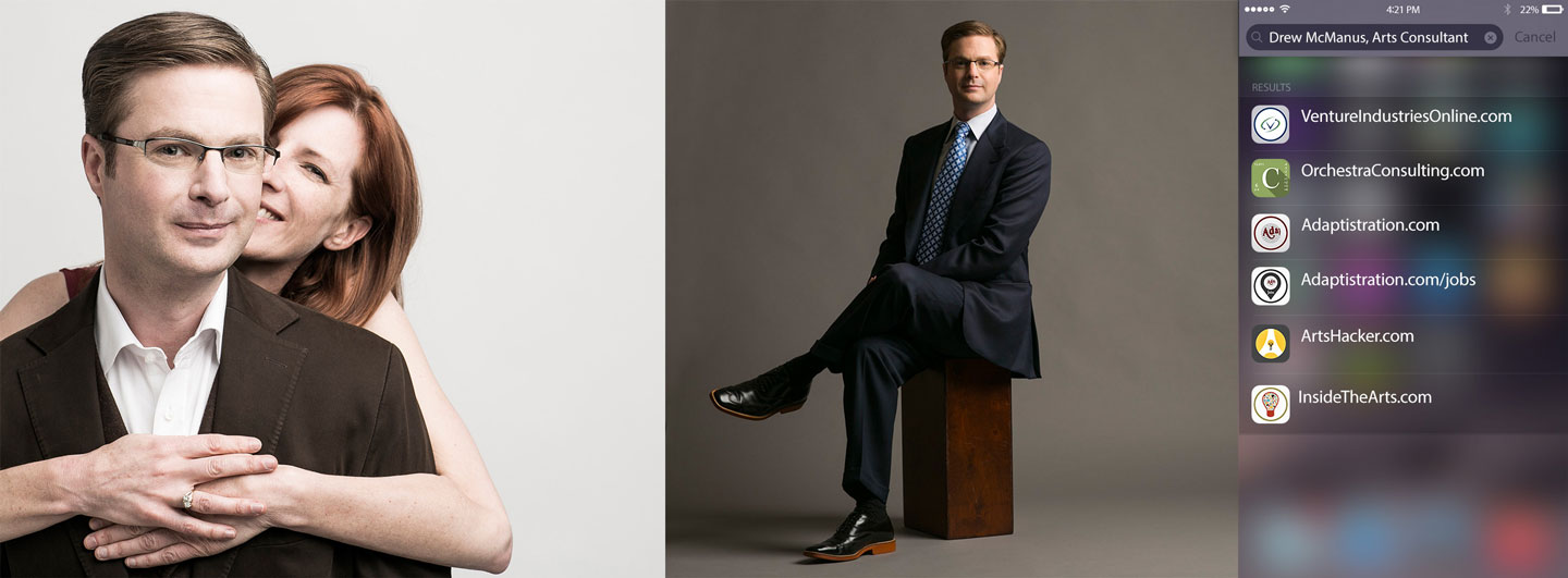
Here is a header image I recently designed for my personal Facebook profile using Cabera’s template. The entire image took 10 min (most of that was spent customizing the iOS8 style search screen mockup, which you can download here from always awesome design duo of Teehan+Lax).
[button link=”https://www.twelveskip.com/tutorials/facebook/1291/facebook-new-cover-size-template” bg_color=”#449BB5″ border=”#449BB5″]Go To TwelveSkip’s Facebook template post[/button]
From a comparative perspective, LinkedIn has one of the most restrictive, frustrating header template requirements so if you feel like kicking them in the virtual shins revel in a bit of solace that it’s not you, it’s them. As such, don’t expect to do much here and be happy with whatever you end up with.
I would show you the header image created using Cabera’s template but the way LinkedIn implements them is so bad it simply isn’t really worth it. If nothing else, at least the image didn’t take more than a few minutes to create.
[button link=”https://www.twelveskip.com/tutorials/linkedin/1294/linkedin-header-background-size-template” bg_color=”#449BB5″ border=”#449BB5″]Go To TwelveSkip’s LinkedIn template post[/button]
Google+
Yes, Google+ matters and you should have just as polished of a presence there as any of the other social media platforms. One bonus here is Google+ is one of the most generous with regard to available design space thanks to a smart application of the full width header (hint: it’s not actually full width).
Here is a header image I recently designed for my personal Google+ profile using Cabera’s template. The entire image took a few minutes (the iOS8 mockup is just copy pasta from the Facebook version above).
[button link=”https://www.twelveskip.com/tutorials/google-plus/1128/new-google-plus-cover-photo-size-2014″ bg_color=”#449BB5″ border=”#449BB5″]Go To TwelveSkip’s Google+ template post[/button]
[hr]
* As an aside, here is a good example of converting a photorealistic design to a flat design: here’s the original header image and here’s the flat design version.


