You’re doing it wrong.
Do your online ads simply link to your homepage? Maybe you link directly to an event page or ticketing page. Okay, you’re doing better, but you’re likely still missing out.
Landing pages are vastly underused in the arts. A landing page is simply the first page someone sees after clicking an online ad or an email or, heaven forbid, scans a QR code (is anyone still doing that?)
Maybe you think a landing page is only for scammy lead generation or over-promising, get-rich-quick online video courses. Nope. See above. It simply means someone accepted your invitation to keep talking, and now you have to pitch them your ask.
For arts orgs, this can be a variety of things: ask them to subscribe to your newsletter, get them to buy tickets to your event, RSVP to a lecture, you name it. For example, I found it very helpful to have an offer landing page with all the discount details before sending folks to the ticketing site (which was more or less out of our control).
So how do you build a landing page?
First thing to know, it’s not about the format.*
* Yes, there are visual patterns how people scan a page and there are key elements of a landing page. But what works for one, might not work for another.
There’s nothing like “your input fields need to be in a right-aligned column” or “your CTA button needs to be blue/orange/polka dots.”
Only test-and-learn will tell what design works, what color button converts, and what key words hit the spot.
So where do you start?
You start with your goal. What is it? What is your value proposition? Why should people click through to the next page or complete your form?
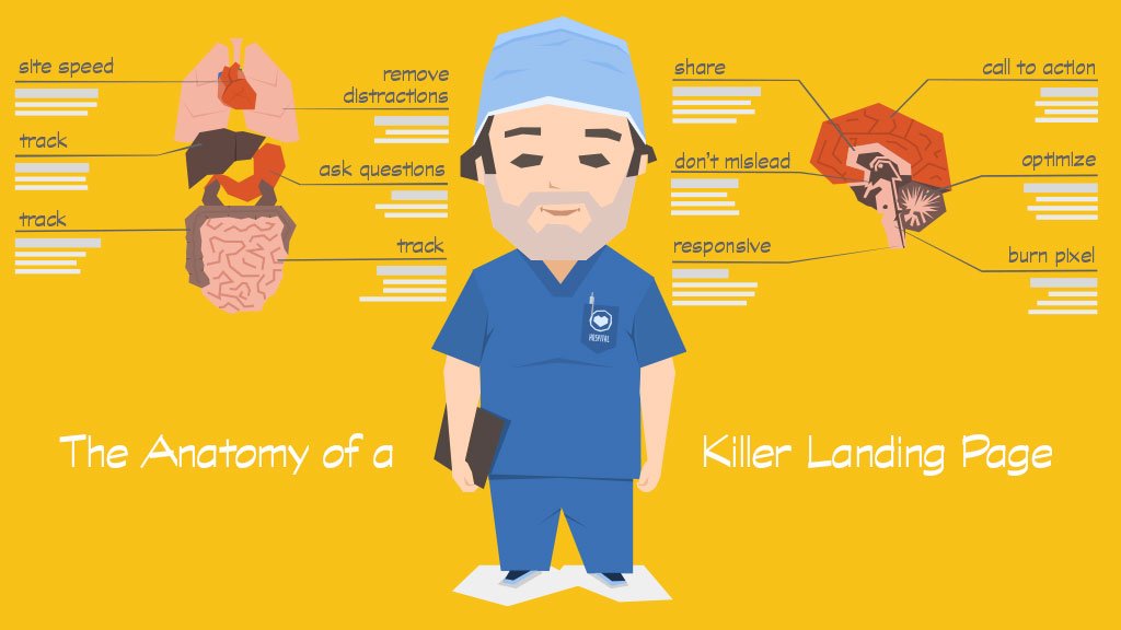
Then build your content with the following “rules”:
[box]
Do not mislead.Your landing page needs to match the vehicle that drove the traffic. Use the same or similar language and imagery. In email marketing, it is well-established that you simply do not trick people into opening your email with a mismatching subject line. The same for landing pages. Don’t get people there under false pretenses.
[/box][box]
Get out of the way. I use this as my general marketing mantra. Many times, marketers just need to get out of the way. Make your path effortless. But what does this mean concretely?
- Your landing page needs to be mobile responsive. It may even mean you hide elements for a mobile device. Perhaps your desktop version has a video, but your mobile version does not.
- Site speed. If your page doesn’t load fast enough, you will lose conversions. That’s not correlation, that’s causation. This is also why mobile responsiveness is important.
- Remove distractions. No navigation menu, and no links elsewhere. Offer users a path back or to the home page if you must, but don’t allow them to get distracted and browse away. You know what this means? No social sharing links on your landing page! Let them convert before they share!
- Call to action. You have one call to action, not two or three. That video on your landing page? Technically, that’s a call to action (pressing play!). Keep it simple, and keep it clean. Remember your goal.
- Optimize your form. If your landing page includes a form to fill out, know that the more you ask, the fewer conversions you’ll see. Also think about what you’ll ask. Do you need it? Can you ask it later? And when you can, pre-fill your form automatically (read more here).
[/box][box]
Track, track and track. You can’t test and learn without tracking. At a minimum, set up Google Analytics (see here). You may also want to consider services like Crazy Egg (see here). Do some A/B tests (with modern CMS systems, it should be easy enough to create two versions of a page). Maybe you’ll find you can optimize different landing pages for different traffic sources. Does Facebook traffic exhibit different behavior than AdWords traffic?
[/box][box]
Don’t forget to say thank you. Once someone completes your call to action, how do you say thank you? A thank you page might not be the end station. Here’s what you need to know:
- Ask a few more questions. If someone completed the first name, last name, and email fields, ask them a couple more items. The conversion rate for these follow up questions is through the roof!
- Now ask them to share. Remember how you couldn’t afford to send visitors off to social media before conversion? Well, they’ve converted. Ask them to share now! Even better, customize the share with something like “I just RSVPed to xyz event.” There’s no better selling than social proof!
- Burn pixel. If you put a retargeting pixel on your landing page, don’t forget to put a burn pixel on your thank you page. No need to keep preaching to the choir!
[/box]
This should give you a solid framework to start thinking about your landing pages. As you delve into it, you’ll find more and more things to think about. But please, for the love of conversions, no more sending someone to your home page. Make it easy for them to do the thing you want them to do. That’s what a landing page is.

Thank you for the authoritative read on this issue. To me, being able to actually see the icon in the…