Master Responsive Web Design With Chrome’s Device Mode RELOADED
By
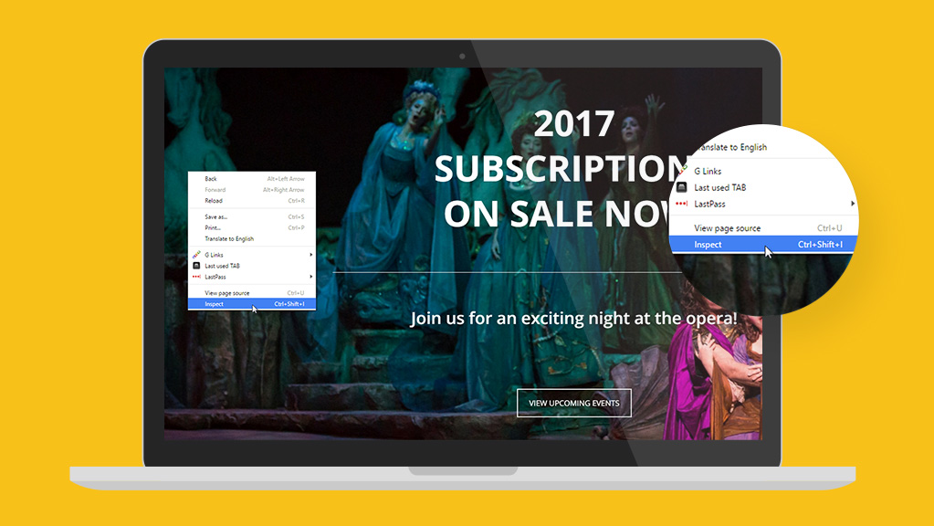
Along with death and taxes, you can be certain that Goggle will update the integrated tools inside its Chrome browser. One of the latest updates includes enhancements to their device emulator, a feature we covered in detail via an article from 7/15/2015. You can visit that post to better understand why this tool is important and how it will help you master the art of responsive web design, but today’s post is going to cover ...
Using The Internet Archive’s Wayback Machine To Improve User Experience
By
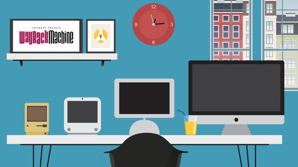
The Internet Archive’s Wayback Machine, which archives screencaps of your website, has been around for some time and it’s just as useful now as ever. Sure, it’s fun to see how some of the cringe-worthy designs from 2001 but go back within the last year and look for changes. Outside of something like your homepage hero image, is anything different? If not, then you just discovered a problem that needs to be addressed and here’s how you can go about fixing it.

Begin Thinking About User Experience As Your Brand
By
Does your organization still design print material first then use that as the basis for your online design? If so, you’re not only behind the marketing curve, you’re losing ground at record speed. Case in point, take a good hard look at Google’s Material Design language, their formal effort to begin standardizing user experience with specs that continuously evolve. Without getting into too much of the geeky details, Material Design shatters the notion that brand ...
Thank you for the authoritative read on this issue. To me, being able to actually see the icon in the…