The Internet Archive’s Wayback Machine, which archives screencaps of your website, has been around for some time and it’s just as useful now as ever. Sure, it’s fun to see how some of the cringe-worthy designs from 2001 but go back within the last year and look for changes.
Outside of something like your homepage hero image, is anything different? If not, then you just discovered a problem that needs to be addressed and here’s how you can go about fixing it.
First, it is important to understand that the age of massive redesigns every few years is an antiquated approach for developing your web presence. If this is news to you, add this article by Louis Rosenfeld at SmashingMagazine.com to your reading list.
Next, if you have adopted a diagnostic driven, always tweaking approach toward your website, it pays to keep a visual record of those changes. This is where the Wayback Machine can come in handy if you don’t do this directly via manual screencaps (resources).
The goal here is to capture the subtle changes in layouts so as to make it easier to gauge if those changes are producing the sorts of results you’re after.
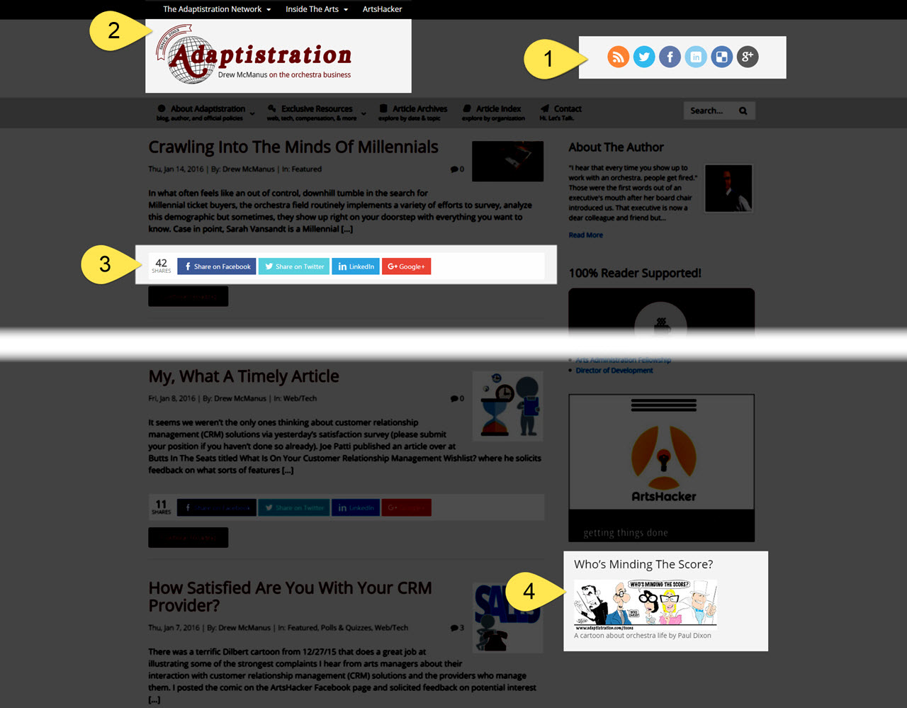
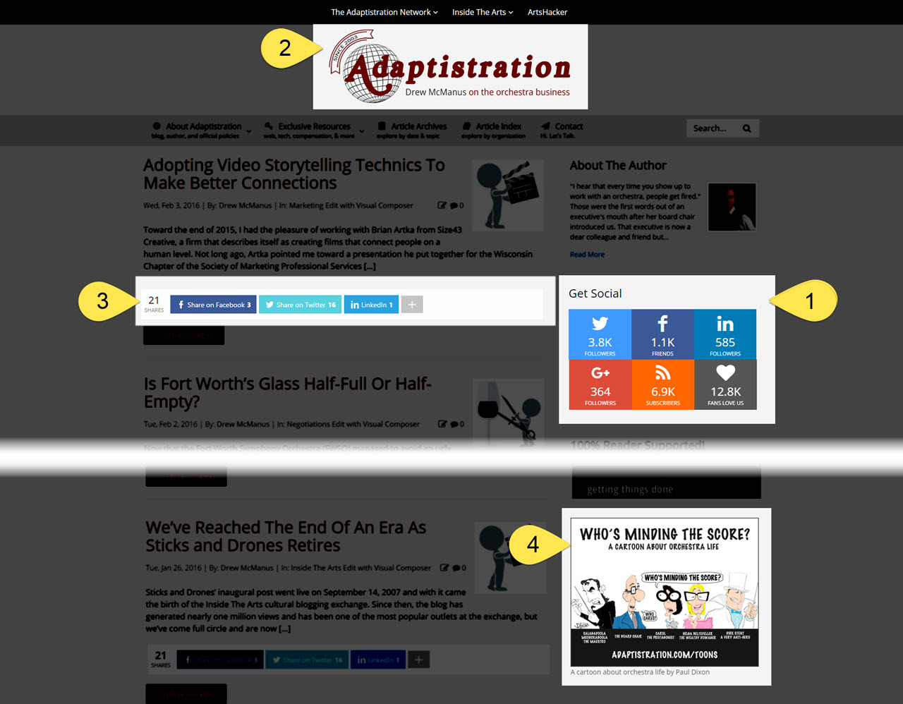
As an example, I recently wrapped up a metrics based assessment for my blog’s homepage and put the following changes in place based on what the data was telling me:
[twocol_one] [/twocol_one] [twocol_one_last]
 [/twocol_one_last]
[box]
[dropcap]1[/dropcap] Problem: social media badges in the header where causing issues on mobile devices.
Solution: relocated the social media badges from the header to the sidebar. Metrics indicated that even though conversion was good on desktop devices, the badges took up too much space on mobile devices, where they wrapped below the logo. The change was good pretense for upgrading the social media badge user experience by introducing new functionality that draws user counts in real time from the source platforms.
[/box]
[box]
[dropcap]2[/dropcap] Problem: as a byproduct of the change via item #1, there was now a great deal of awkward looking white space in the header on the desktop version of the site.
Solution: rearranged logo and top navigation. With the social media badges gone, there was room for a fuller, centered version of the logo, which works better on retina devices. The top nav menu was centered as well in addition to introducing a mega menu user interface. One added benefit of centering this content is it minimizes element shift across mobile to desktop viewing along with naturally moving eyeballs down to the content.
[/box]
[box]
[dropcap]3[/dropcap] Problem: share buttons below post excerpts forced line breaks on mobile devices.
Solution: reconfigured the share buttons. Metrics indicated that readers favor Facebook, Twitter, and LinkedIn so the Google+ button was moved inside the More button. This eliminated the problem of buttons forcing a line wrap when viewing the site on a tablet in either landscape or portrait orientation.
[/box]
[box]
[dropcap]4[/dropcap] Problem: a decrease in clickthroughs to the cartoon via its sidebar banner.
Solution: created a larger banner for the cartoon. The new image was designed with the same aspect ratio as the ArtsHacker banner above it. The new image includes expanded teaser content and a look that corresponds with the other nearby elements.
Bonus: the larger dimensions now allow the image to occupy 100% of column width on mobile devices.
[/box]
Additional changes include a new configuration scheme for social share buttons on Smartphone size mobile devices so as to eliminate line wrap issues as well as removing the post featured images (view). All of this puts more content on the screen and makes it easier for visitors to navigate.
Ultimately, this should provide a worthwhile case study for how you can go about improving your website visitor’s user experience.
[box type=”note”]Wayback Machine Tip: In addition to searching for archived screencaps of your webpage, you can also search for interior pages. If you haven’t changed up the URL permalink structure very often, you can go back through several years of interior page layouts.[/box]

Thank you for the authoritative read on this issue. To me, being able to actually see the icon in the…