Once you’ve got your Instagram account set up and have made goals and content decisions, now, you’ll need to start posting pictures to your profile. This is the fun part.
Like other social media and mobile phone cameras, the Instagram app gives users the opportunity to edit their pictures and to add filters to pictures, which are pre-determined and set combinations of various photographic settings. A theater’s light board has one set level that makes the stage go dark and another set level that brings up floodlights…it’s the same thing here, but with your pictures instead of your stage. Choosing a filter, like your stage lights, can set the tone of your picture or highlight or hide different aspects.
[box type=”note”]Before you read further, know this. You do not have to use a specific filter for any specific photo. You don’t have to always use Lo-Fi for events shots and Moon for portraits. There is no “right” filter. There are a variety of filters to use that have pros and cons and bring out different things. So, experiment to see what filter looks best on your particular picture.[/box]
A List of Filters
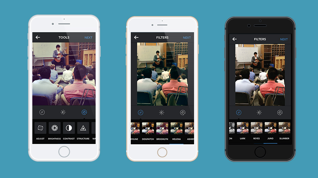
The current version of the app has 40 photo filters* and also allows you to adjust certain settings in photo by yourself, a “normal” setting, so 41 settings in total. Filters will look differently on each picture you take depending on the light you take it in, your proximity to the subject, and even the background. But, generally, here’s what happens with each filter:
1. Clarendon: Brightens the photo
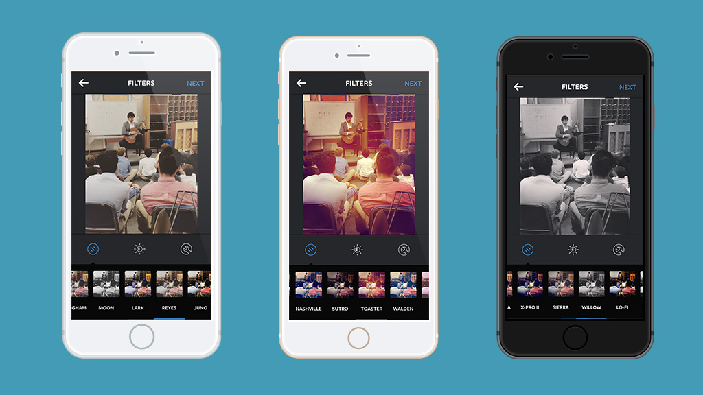
2. Gingham: Washes out the photo, dulls it, and softens the content
3. Moon: A black and white setting that brightens the picture
4. Lark: Overall, brightens the image, particularly any light colors
5. Reyes: Washes the photo out and flattens the content
6. Juno: Brightens colors, and particularly lighter colors or orange-red hues
7. Slumber: Gives the photo a yellow tint all around
8. Crema: As the name suggests, gives the photo a cream tint and lightens the picture a bit
9. Ludwig: Yes, Beethoven has his own filter. This filter amps everything up – all colors are bolder and images come into sharper focus
10. Aden: Brightens photos, washes them out a bit and softens everything. It also has a bit of a very soft pink hue to pictures.
11. Perpetua: Hightens light blues, greens, and yellows in your photo.
12. Amaro: Highlights content in the center of the photo and intensifies shadows
13. Mayfair: Another filter that highlights the center of the photo, but also intensifies colors and adds a vignette to the edges
14. Rise: Brightens the photo, brings out yellow or gold tones, also intensifies shadows
15. Hudson: Gives the center of the photo a slight focus, but cools the colors in the whole picture
16. Valencia: Brightens all colors
17. X-Pro II: Creates a serious vignette around the edges and darkens the center of the picture just a bit
18. Sierra: Lightens the picture overall, washes it out a bit, highlights the center, and gives the edges a subtle vignette
19. Willow: Another black and white filter that is darker than Moon and a little washed out
20. Lo-Fi: This is my personal favorite. This filter bumps up the contrast and intensifies the colors.
21. Earlybird: Gives the picture a vignette and warms the whole photo, but washes out colors a little
22. Brannan: Majorly ups the contrast and gives the tiniest hint of a yellow or tan hue
23. Inkwell: Another black and white filter that amps up the contrast
24. Hefe: Gives the photo a golden hue, subtle vignette and warms up the photo overall
25. Nashville: As a Tennesseean, I’m proud that my state is well represented in the Instagram world. Although, no clue why this particular filter was named after Nashville. This filter brightens the whole photo, minimizes shadows, and gives it a vintage-y feel.
26. Sutro: Majorly darkens the entire photo, gives it a vignette
27. Toaster: This reminds me of pictures I took with the shake-it-like-a Polaroid picture cameras. It adds an orange tint to the entire picture that is most noticeable in the center and adds a vignette to the edges
28. Walden: Brightens most of the picture from the center out,
29: 1977: Totally a vintage filter, this gives the picture a red tent and dulls the content overall
30. Kelvin: Gives the photo an obvious golden-orange tint
31. Stinson: Washes and dulls the photo just slightly
32. Vesper: Brightens with a hint of yellow and ups the contrast
33. Maven: Brings out shadows a lot and yellows the picture just a bit
34. Ginza: Brightens the picture with the tiniest hint of yellow
35. Skyline: Brightens the picture and warms up warmer colors
36. Dogpatch: Adds major shadows and ups the contrast
37. Brooklyn: Brightens the picture with more of a white tint
38. Helena: A subtle filter that warms already warm colors
39. Ashby: Another filter that brightens with a gold hue but also dulls the content
40. Charmes: Ups the contrast and gives pictures a red tint
*It is possible to post videos in Instagram. Videos have their own set of filters and another post on what you need to know about videos is coming soon – stay tuned!
Applying A Filter
As mentioned above, there are no wrong filters in Instagram. So, after you take your picture and get into the editing part, experiment with what filters look best. Tap each filter in the row at the bottom to see how the picture looks with that applied. When posting a picture, I often quickly tap each one and take a mental note of which ones I like the best. Then, I go back and compare the filtered photos by tapping one option then scrolling to the next option before making a decision.
If you decide you only want a little bit of a particular filter added, double tap the small picture in the row and a slider will come up where you can adjust the level manually. You can also add a frame to the picture by double tapping the same small picture and tapping the square that appears next to the slider.
Manually Adjust Settings
On the same screen with the row of filters, you’ll see an icon that looks like a sun and another that looks like a wrench. These icons allow you to manually adjust brightness, contrast, shadows, highlights, and more. Some settings to take a look at:
- Structure: Structure sharpens the content a bit, but gives it a bit of texture. Tap the icon and a slider will appear.
- Color: You can manually add a tinted hue to your pictures. Tap the color icon and a rainbow of dots appears. Tap the color you’d like to add. Tap the same color a second time for a slider where you adjust the saturation.
- Tilt Shift: This is great if there is something in the picture you want to call major attention to. It allows you to soften parts of the photo with either a circular or linear filter. Once you’ve chosen the what shape you want it to take, tap the picture to move it to the area you want to focus on. Want it smaller or larger? Use two fingers to change the size.
Once you’ve filtered and adjusted, tap “Next” at the top of the screen to write a caption, add location, tag people and share!
Happy Instagramming!
Thank you for the authoritative read on this issue. To me, being able to actually see the icon in the…