Master Responsive Web Design With Chrome’s Device Emulator
By
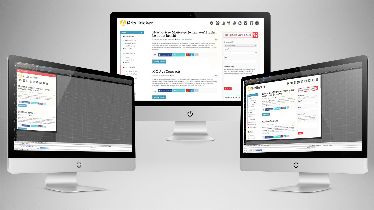
[box style=”note”]There is a more recent version of this article available that includes updated instructions on how to activate and use this Google Chrome tool.[/box] One of the single most daunting problems arts orgs face when converting to responsive design is embracing the mobile first concept; meaning, you no longer envision website design from a desktop-only or desktop-first perspective. Instead, you need to begin with the mobile browser environment and work your out from there. ...
Why White Space Is Crucial To UX Design
Just the other day I came across this great article written by Jerry Cao and Kamil Zieba and Matt Ellis on Fast Company about website design. As arts organizations, we sometimes feel that we need to put a lot of information on every page of our website so that people can see everything we offer. However, we must resist that temptation and learn to love white space in order for our websites to be as effective ...

Infographic: Optimal Image Sizes For All The Social Networks
I bet I spend a few hours a month just resizing photos for our website and social media accounts. Oftentimes, many managers might just use a photo that’s already been resized for something else but doesn’t quite fit the parameters that are optimized for a particular site. In can be daunting trying to figure out what size photos go where on what platform. I found this handy infographic from Spredfast on the Marketing Land website ...
Thank you for the authoritative read on this issue. To me, being able to actually see the icon in the…