This series is designed to help those working in the arts and culture sector apply user experience (UX) best practices to daily content management tasks. Using Jon Yablonski’s collection at LawsOfUX.com that gathers best practices designers consider when building user interfaces, these articles will show you how each practice can be applied to more than just user experience tasks.
Law of Common Region
Per https://lawsofux.com/law-of-common-region/ here’s how the Law Of Common Region is defined:
Elements tend to be perceived into groups if they are sharing an area with a clearly defined boundary.
- Common region creates a clear structure and helps users quickly and effectively understand the relationship between elements and sections.
- Adding a border around an element or group of elements is an easy way to create common region.
- Common region can also be created by defining a background behind an element or group of elements.
Origins
The principles of grouping (or Gestalt laws of grouping) are a set of principles in psychology, first proposed by Gestalt psychologists to account for the observation that humans naturally perceive objects as organized patterns and objects, a principle known as Prägnanz. Gestalt psychologists argued that these principles exist because the mind has an innate disposition to perceive patterns in the stimulus based on certain rules. These principles are organized into five categories: Proximity, Similarity, Continuity, Closure, and Connectedness.
Let’s examine some real-word examples where you can put this into practice.
Website Content Management
Regular page content is a great place to implement the Law Of Common Region and it’s something I include in client designs quite frequently in the form of grouping content into horizontal sections.
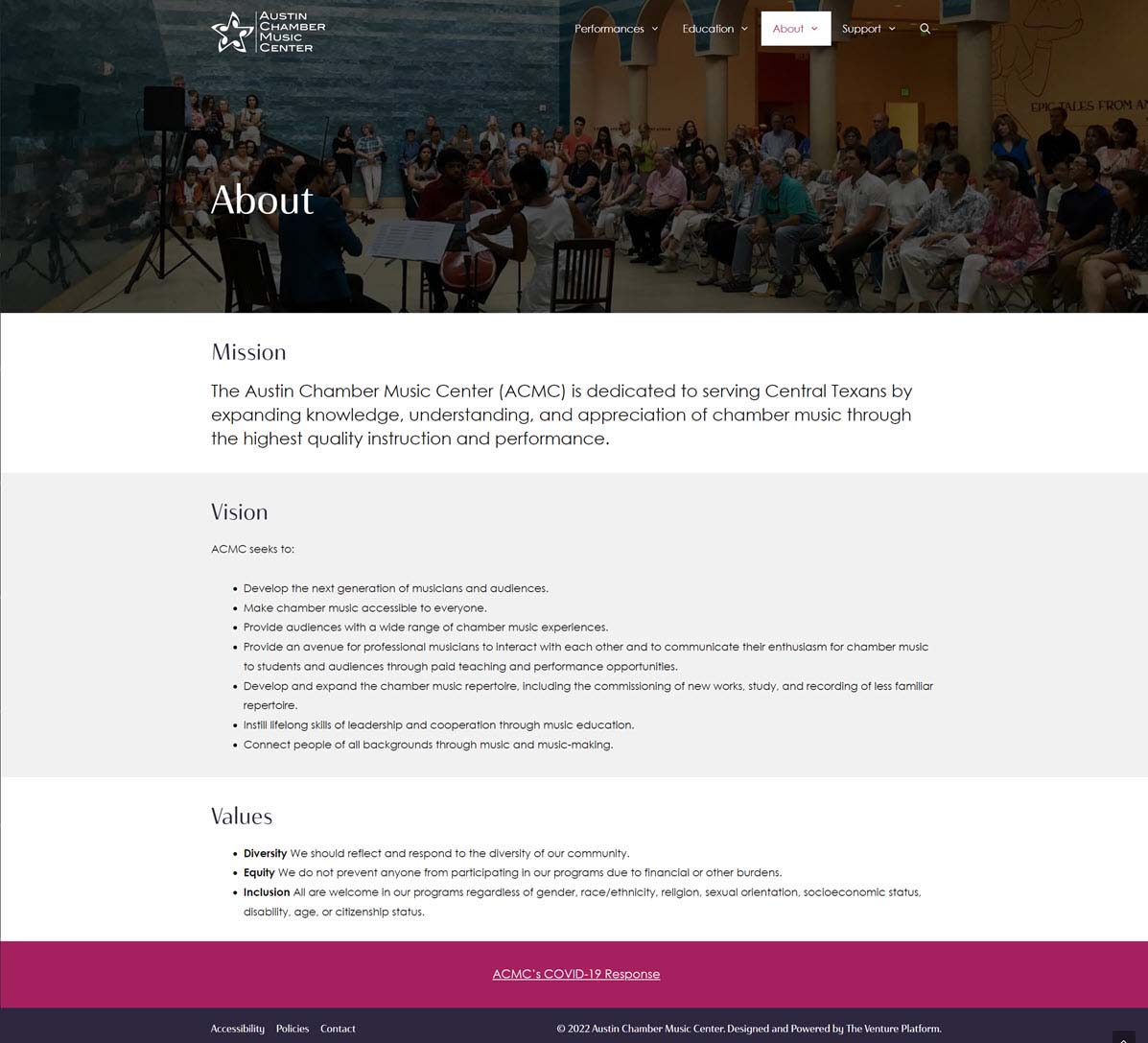
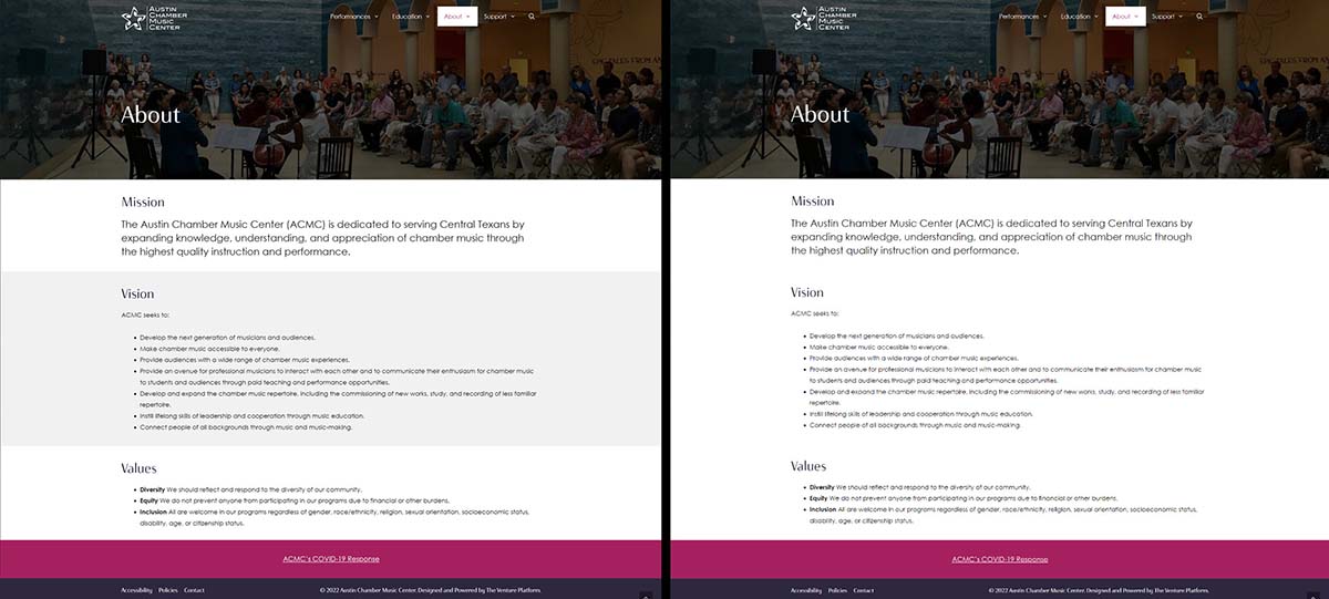
In this example from Austin Chamber Music Center’s About page, the background color for each section alternates between white and a very light gray. It’s not enough to distract, but enough to help visitors group content and increase their time on page.
Now compare how that same page looks with the alternating background color removed.
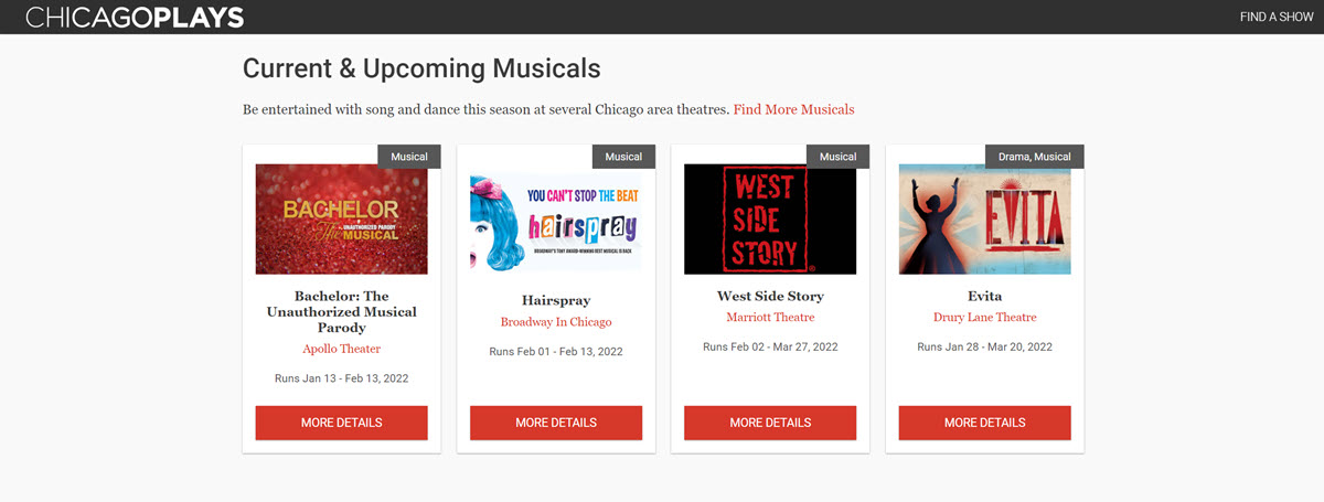
We can drill down even more by grouping content within a section by using a card with borders. ChicagoPlays.com uses a card design for displaying upcoming events from their member theaters. In this example, the common elements are the details for each event.
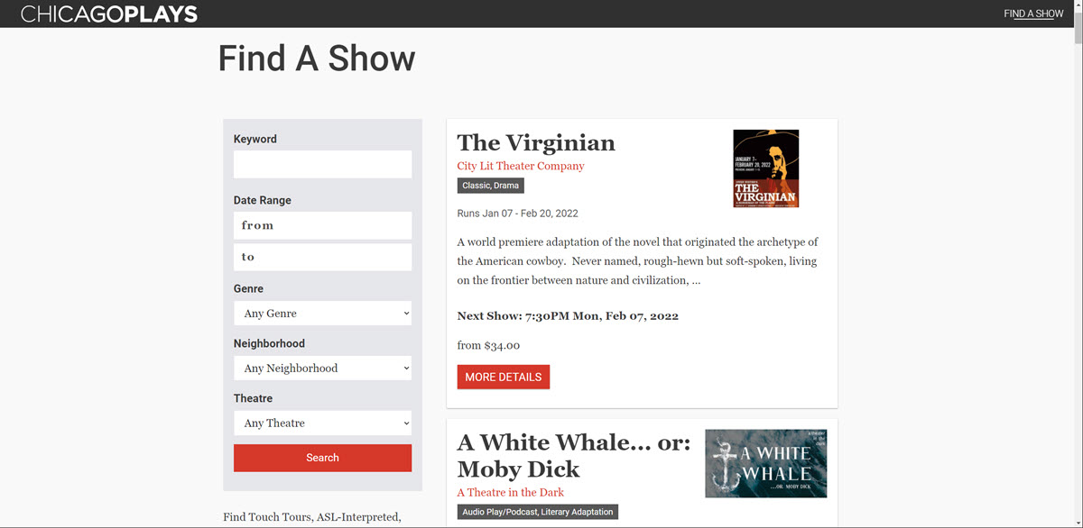
You can begin to combine this approach for mixed content within the same page. Here, ChicagoPlays.com uses a background color to create a visual where their event filters live. To the right, bordered event cards make it easy for visitors to skim results.
Beyond Solid Colors
While solid color backgrounds are a solid option, you can kick things up a notch and apply the Law Of Common Region effect using background images to help create clear visual grouping.
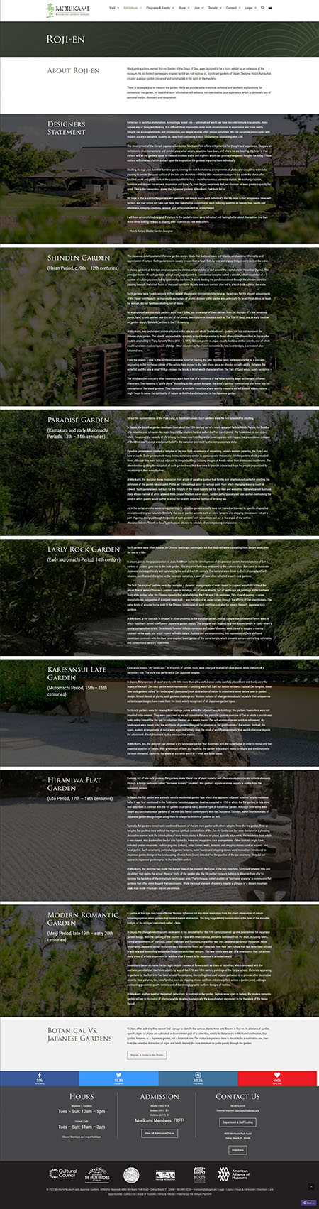
The Morikami Museum and Japanese Gardens website uses some striking photography to good effect to highlight each of their gardens.
It also helps make what might seem like a very long page easier to navigate and improve engagement thanks to the added impact from background images.
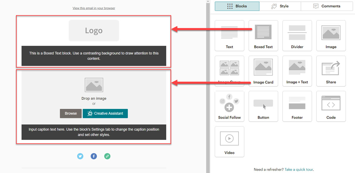
Email Campaigns
Given how straightforward this approach is, you can begin to see how it can help with other communication channels. Providers like MailChimp go so far as to offer ready made modules that create containers with color backgrounds for both regular text and image + text options:
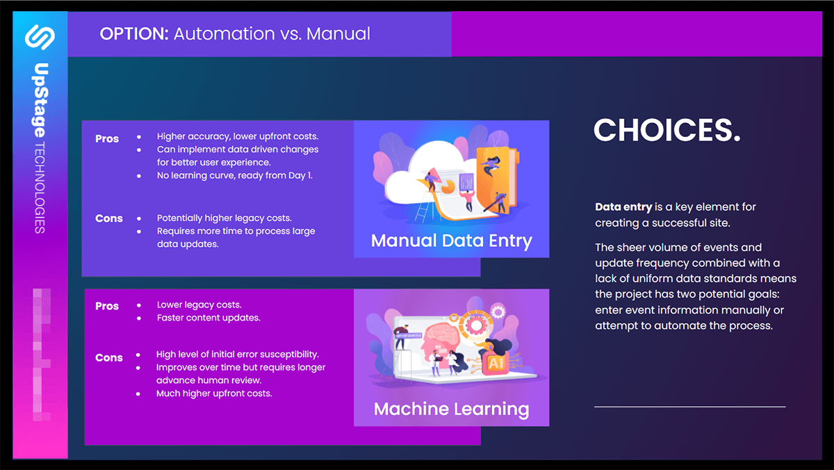
Presentations
Hopefully, you’re already starting to think about applying common regions to a variety of mediums and one you shouldn’t overlook is presentations. I recently created a new proposal template for UpStageCRM, and it uses common regions. In this example, it’s used to help distinguish between two development options for potential clients to consider.
Slippery Slope
This is such an easy method to apply, it can get out of hand in a hurry if you aren’t careful. If your content starts looking like checkerboard, you’ve probably gone too far 😄
Use the following tips to help keep on track:
- Anytime copy is broken up with a header, it could be a good candidate for applying a common region container.
- Avoid using them as separators. Let the content guide you; does if fit into proximity, similarity, continuity, closure, and connectedness?
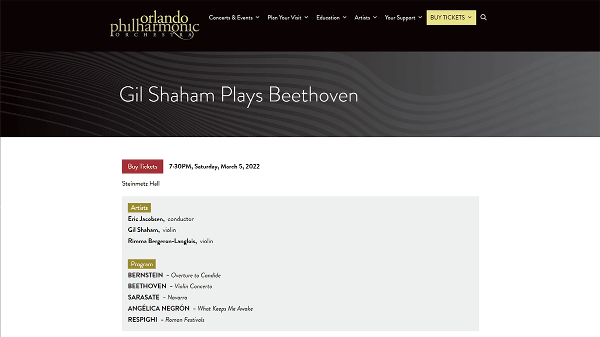
- High priority list-based content can benefit from a common region container, like this event page from Orlando Philharmonic’s website:
- Don’t get carried away with colors that throw you out of accessibility compliance (details).
Show Yablonski some love and order one or more of the posters he designed for each practice covered at lawsofux.com, which is completely free to use. You can purchase them at his online store.

Thank you for the authoritative read on this issue. To me, being able to actually see the icon in the…