Web content accessibility is an increasingly important topic and if it isn’t already on your radar, it should be. At the heart of accessibility are the Web Content Accessibility Guidelines (WCAG), a central element of a series of web accessibility guidelines published by the Web Accessibility Initiative of the World Wide Web Consortium (W3C), the main international standards organization for the Internet.
You can dig into the nitty-gritty at the organization’s resource website and you should reach out to your web provider and designers to get their take on how they are working toward compliance.
As of now, WCAG compliance is not required on any national level, but that could change. You can prevent getting blindsided by regulations by starting the review and modification process now, so changes can then be rolled out in stages.
This will help you control costs, understand WCAG standards better, and prevent several months of operating in panic-mode.
It’s worth noting that quite a bit of these standards will include items you’ll never see, such as modifications and updates to the code that runs your websites. But there are a few things you can begin doing yourself, regardless of technical skill level. One of the lowest hanging pieces of fruit is making sure the colors you use on your websites have the proper amount of contrast.
Getting Started With Color Contrast
A great jumping off point is checking your link and button colors. In the following example, the button background color is red, hex code color #d6382a*, and the button text (foreground color) is white, hex code color #FFFFFF.

Next, check the hover/visited state color:

In this instance, the hover background color is #58355e and the foreground text color is #FFFFFF.
Those are the color combos we need to verify have enough contrast to comply.
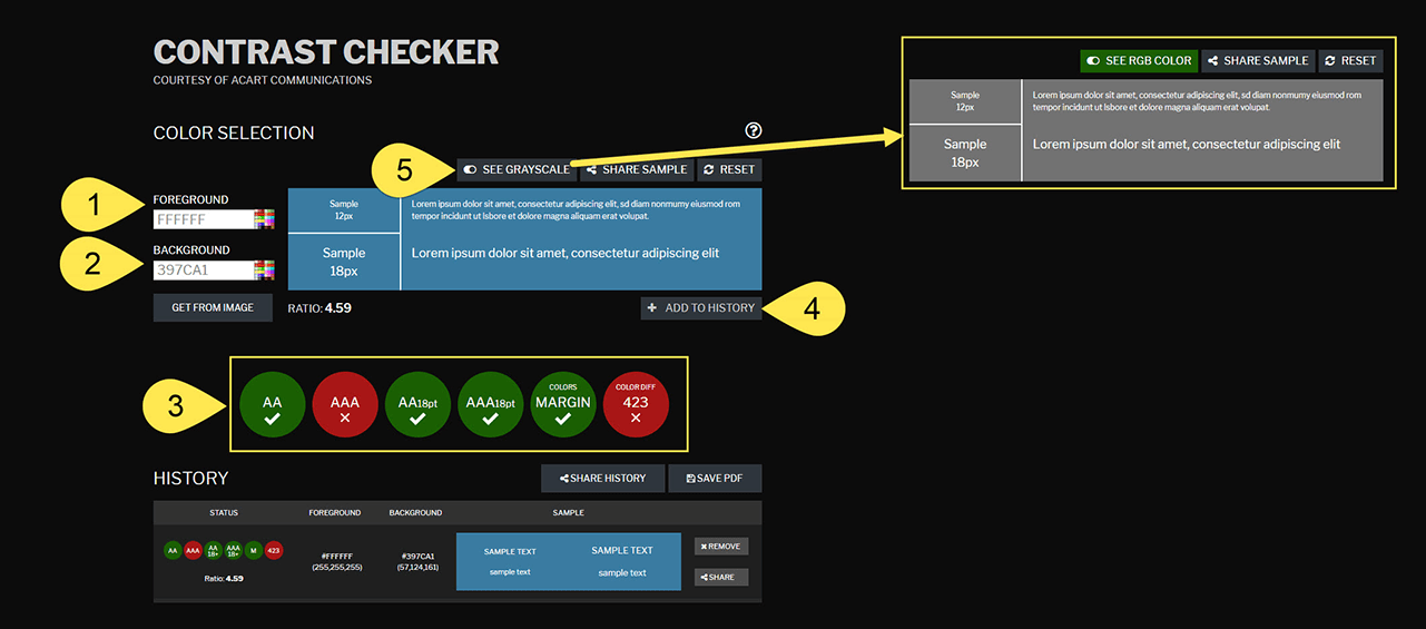
To get started, visit https://contrastchecker.com and add it to your bookmarks. It’s a wonderfully easy to use resource built for designers and developers to test color contrast compliance with the Web Content Accessibility Guidelines but it’s straightforward enough, anyone can use it.

- Select a foreground color or enter the hex code.
- Select a background color or enter the hex code. Alternatively, you can use the “Get From Image” option to pull colors.
- The system automatically updates the results to assign a pass/fail, margin or fail, depending on your selections.
Tip: hover over the results for more info about testing conditions applied. - Select ” Add To History” to add the color combo to a list you can export in a pdf file.
- The “See Grayscale” button will let you see how those colors appear to a colorblind user.
Don’t Forget Page Background Colors
In addition to text and button colors, you need to check the color contrast with those elements and the webpage background color.

In the example from the start of this process, the page background color is the same as the text color (#FFFFFF), so you don’t actually need to test since the results will be the same. But let’s say the page background was off-white, like #F5F5F5.
In that instance, the dark purple (#58355e) color would pass all levels but the red (#d6382a) would fail more levels than pass.
Don’t Panic
Seriously, don’t panic. Odds are, you’ll discover most of the colors in your existing palette won’t pass.
Does that mean you need to change those colors you spent so much time and effort meticulously massaging into the perfect combination?
Yep.
Deep breaths…don’t panic…it’s going to be okay.
This is a good thing because doing a better job at making your website accessible means you open up your organization to a broader patron base and demonstrate that you care about things like making sure your online presence is able to serve the full spectrum of potential visitors.
Next Steps
Now that you’re starting to discover how accessible your color contrasts are, you have a good idea for how much work is needed to make changes.
An ideal time to begin getting into that good habit is your next design cycle.
You’ll want to ask your designer and/or developer about making sure the work uses color combos that meet WCAG contrast standards. Once you’re comfortable that everyone is one board, you’ll be amazed at how second nature it all becomes.
* Tip: you can use Google Chrome’s Inspector to discover hex codes, here’s a useful tutorial from Google on how to do that.
Thank you for the authoritative read on this issue. To me, being able to actually see the icon in the…