This article is the first in a series designed to help those working in the arts and culture sector apply user experience (UX) best practices to common tasks and beyond. Using Jon Yablonski’s collection at LawsOfUX.com that gathers best practices designers consider when building user interfaces, these articles will show you how each practice can be applied to more than just user experience tasks.
The Serial Position Effect
Per lawsofux.com/serial-position-effect here’s how the Serial Position Effect is defined:
Users have a propensity to best remember the first and last items in a series.
- Placing the least important items in the middle of lists can be helpful because these items tend to be stored less frequently in long-term and working memory.
- Positioning key actions on the far left and right within elements such as navigation can increase memorization.
Origins
The serial position effect, a term coined by Herman Ebbinghaus, describes how the position of an item in a sequence affects recall accuracy. The two concepts involved, the primacy effect and the recency effect, explains how items presented at the beginning of a sequence and the end of a sequence are recalled with greater accuracy than items in the middle of a list. Manipulation of the serial position effect to create better user experiences is reflected in many popular designs by successful companies like Apple, Electronic Arts, and Nike.
Let’s examine some real-word examples where you can put this into practice.
Website Navigation Menu
Your organization’s navigation menu is one of the best components to apply the Serial Position Effect. It doesn’t matter how many items the menu contains (although less is better), identify the two most important items and place them first and last in the order. Locate the next most important item and place it in the second slot then continue through the list accordingly.
I use this all the time with my web development clients, and I have yet to see an instance where it doesn’t make it easier for their site visitors to find what they’re after and complete a conversion, whether that’s monetary, lead gen, or engagement. Here’s an example from the Kansas City Repertory Theatre website:
Tip: if you’re ever unsure where a menu item should fall in the rank, visit your Google Analytics dashboard and let your users tell you what they find most important.
Email Marketing
If your organization sells annual subscriptions, memberships, or ticket packages, odds are you offer several options and some of those packages are more important than others.
Instead of listing them by price, date, or alphabetical, apply the Serial Position Effect. Here’s a pair of examples using subscriptions and memberships.
Subscriptions
In this scenario, Sunday and Friday subscriptions are the most popular choice by 2-1 margin and the group is most interested in increasing Choose Your Own buyers.
- Sunday Night Series
- Choose Your Own Series
- Thursday Night Series
- Family Series
- Friday Night Series
Memberships
The Gold plan has the best revenue performance, individual plans comprise more than 50% of sales, and the group really wants to increase family participation.
- Gold Membership
- Family Membership
- Student Membership
- Senior Membership
- Individual Membership
Regardless how the plans are listed in the email campaign, the ordering will benefit from the Serial Position Effect. You can also run some A/B tests to determine effectiveness.
Content Management
Regardless of the platform where the copy appears, the basic principles apply:
- Lead with your most important message and when applicable, a CTA.
- Close by introducing a new CTA or reinforcing the first one.
- Everything between those two includes lower priority information.
In this example, I’ve used the home page for a new product I launched in 2022, UpStage CRM. The first section includes what I believe to be the most important message and a pair of CTAs. The final section is important because it speaks directly to the user, making it about them and including the higher priority CTA from the first section.
The remaining sections are an experiment. Since this is a brand-new site, the best we can do without extensive user testing is to rely on experience. In order to determine if any changes are needed, I’m reviewing page performance using Google Analytics at the end of each week.
Over time, those metrics will tell me if any adjustments are needed, even if it means replacing the current highest priority item at the top of the page.
Development
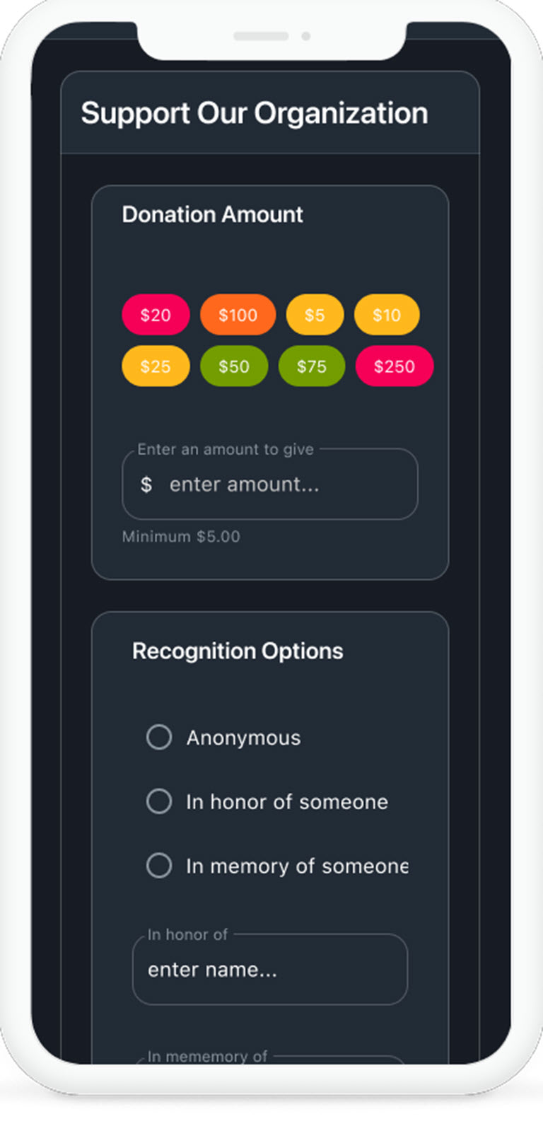
I run into this discussion on a regular basis when I ask clients if they want pre-defined giving amounts listed from lowest to highest or if they want to apply a Serial Position Effect approach.
In a recent client exercise:
- We quantified the $20 amount generated the highest cumulative revenue.
- The development director wanted to see the $250 amount increase most.
- The second most common giving amount was $100.
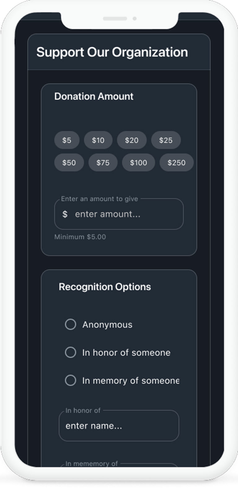
From there, the ordering figured itself out. Here’s an example of the default configuration next to the Serial Position Effect ordering. Keep in mind, we didn’t actually apply colored buttons to the latter, it’s used here for visual effect.
I’m pleased to say the client saw fabulous results: the $20 amount continued to generate the most revenue, they saw a 42% increase in giving at the $250 level and a 15% increase in giving at the $100 level.
Interestingly enough, giving at the $5 and $10 levels decreased but the overall campaign performed 32% better than the previous season.
Show Yablonski some love and order one or more of the posters he designed for each practice covered at lawsofux.com, which is completely free to use. You can purchase them at his online store.


Thank you for the authoritative read on this issue. To me, being able to actually see the icon in the…