NOTE: be sure to check out this article published after this one with updated information and a new option Mailchimp provides to help mitigate this problem.
MailChimp (MC) is one of the most popular email marketing providers for a host of good reasons but even the best of providers have a few minor annoyances and in MC’s case, it’s the inability to dynamically resize images via an RSS campaign so they fit inside both Smartphone and standard email client windows.
Since most desktop email campaign templates are around 600-pixels wide, using images with widths larger than that end up with the image breaking outside the left/right margins and making your otherwise carefully designed template look like garbage.
A few years ago, this wasn’t really a big deal but the advent of responsive publishing platforms, which resize your content automatically and therefore work best when you have source images in the 1000-pixel width neighborhood, combined with an increase in non-blog content using RSS feeds have conspired to make this issue an increasing pain in the tuchas.
At the time this article was published, MC continued to maintain their long standing knowledgebase disclaimer absolving them of any responsibility to solve this problem.
Are your images the wrong size? Often, blog images are pulled into feeds at a size that’s much larger than necessary, which changes the look of your campaign. Talk to your developer or web administrator about changing that image formats on the feed.
That’s a nice way of saying “not it” and dumping the mess into your lap.
Sure, you can address this issue the way they suggest via your web developer, but that’s likely going to cost you some coin; as such, we’ve got your back with a fix simple enough you can do it yourself by adding a few lines of CSS to your campaign template footer.
Don’t Panic
Really, don’t panic.
Just because this hack includes adding some CSS to your campaign template, you don’t need to worry, it really is easy and you don’t have to understand a single bit of code to make it work; instead, it is all going to be straightforward copy/paste.
To begin, make a copy of one of your existing RSS driven campaign templates (always avoid using the original when trying out new skills). Once that is done, open up your footer content module just as though you were going to edit some text.
[box]
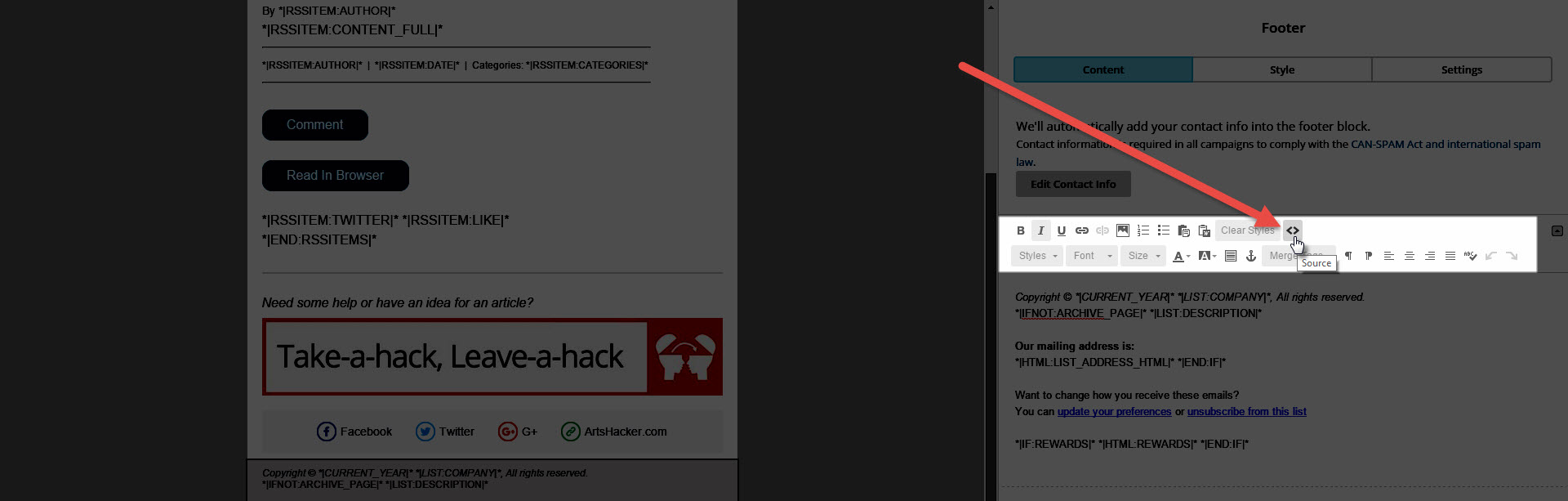
Click the source button located in the top row of toolbar buttons.
[/box]
[box]
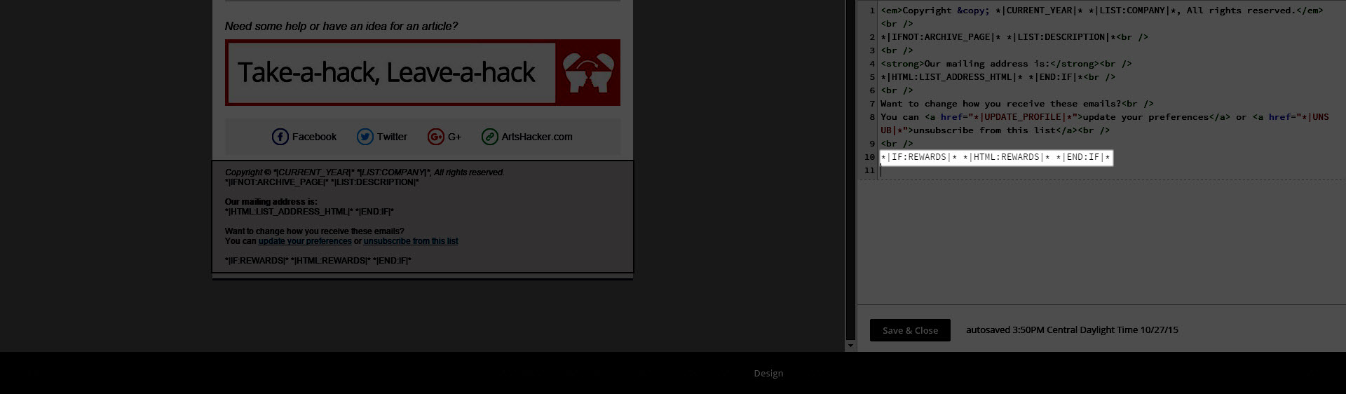
You’ll now see the source code for that module and you want to find the very last line of code, in this example, it is line 10 *|IF:REWARDS|* *|HTML:REWARDS|* *|END:IF|*
[/box]
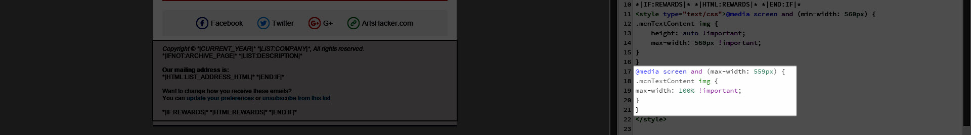
On the very next line, paste the following code:
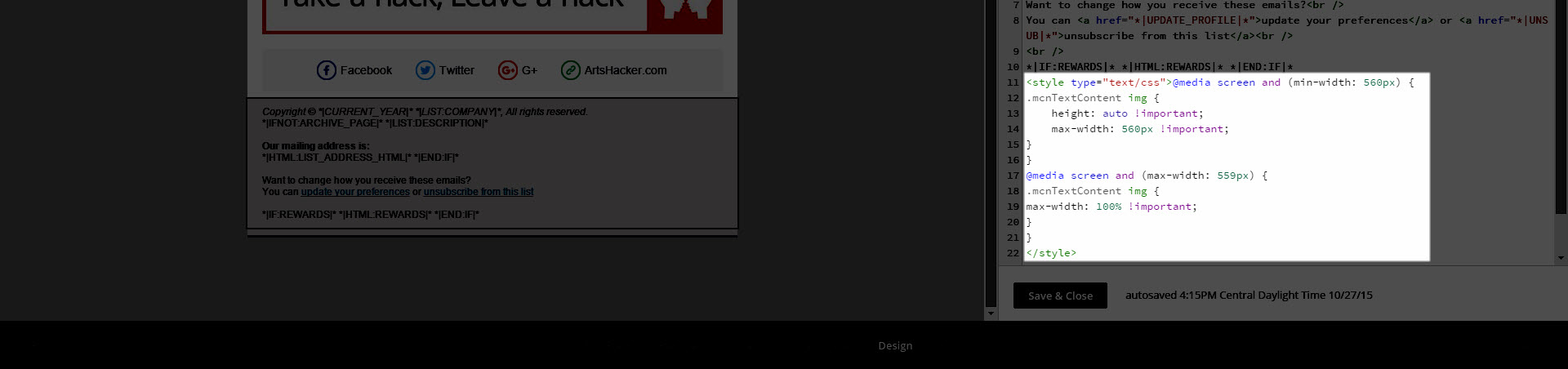
<style type="text/css">@media screen and (min-width: 560px) {
.mcnTextContent img {
height: auto !important;
max-width: 560px !important;
}
}
@media screen and (max-width: 559px) {
.mcnTextContent img {
max-width: 100% !important;
}
}
</style>
When you’re done, it should look something like this:
Click the Source toolbar button again and you’ll return to the friendly visual editor. Click the Save & Close button and you’re all set.
That’s it, pencils down.
Here’s What The Code Does
For those of you who are curious about what just happened, here’s a breakdown.
[box]
This code tells the template that new style instructions are there and to pay attention to them.
[/box]
[box]
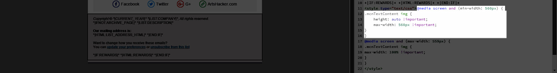
This code tells the template to resize images to 560px wide for any email client window 560-pixels wide and larger, which includes your typical desktop, laptop, and larger tablet size devices. In this instance, the instructions tell the system to resize the image to a precise width so it’s good to make the image width a bit smaller than your template width. Consequently, if you’re using a template that’s wider or narrower than 600-pixels wide, these thresholds and sizes will need to be adjusted. Call your web developer and/or hire a programmer as you don’t want to go monkeying around with too many changes at this level.
[/box]
[box]
This code tells the template to resize images to 100 percent of available width for any email client window up to but not over 559-pixels wide, which should be enough to accommodate even the largest Smartphone widths in portrait mode (tall) and most average Smartphone widths in landscape mode (wide).
[/box]
In case you’re wondering why you need both fixed and percentage width options here in order to produce the best looking layout across the widest array of devices, that’s a good question.
If you use the 100% width option on desktop size email clients, you’ll end up with the original problem of the image size breaking the template container width. If you use the 560px fixed width as your only option, you’ll end up with an image wide enough to break the template on Smartphone width email client windows.
Consequently, the percentage option works great up to a point then hands off the baton to the fixed width option across that 560-pixel threshold.
There’s No Substitute For Testing
Before you start using a template these adjustments, you’ll want to perform a few tests including, but not limited to, sending a test email message when you know the RSS driven content includes an image that is larger than 600-pixels wide. Even better is to set up this copy version of your campaign so that it sends to a list of you and a few others you trust to let you know how it looks across different devices and let it run for at least one real-world campaign.
Once you’re satisfied all is working as planned, switch over to using the modified version of the campaign for your active list.
I Still Find Code Scary, Is There Another Option?
If all of the code still seems a bit overwhelming, you can always use MC’s ChimpFeedr service, which although designed to combine multiple RSS feeds into a single, new feed, it does provide an option to resize images. Moreover, you can use it for a single feed without problem.
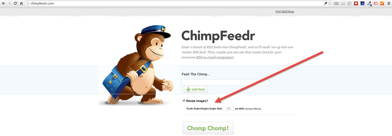
The only downside here is it’s really a one-size-fits-none type of solution in that you’ll end up with an image size that is too big for smartphone widths or too small for larger devices. Having said that, it’s still better than doing nothing and having an image that is large enough to break container widths across all devices.
NOTE: be sure to check out this article published after this one with updated information and a new option Mailchimp provides to help mitigate this problem.
Thank you, thank you!!!
I really appreciate this. Unfortunately, it looks like Gmail now ignores this CSS. Looks great everywhere else though. Any ideas?
Don’t forget to check out the newer version of this post, which was mentioned at the very top of the article: https://artshacker.com/if-you-use-mailchimp-rss-campaigns-youre-going-to-want-this-information/
Worked like a charm. Thanks!!
Nope. Didn’t do a thing. My images are 350px width. I want the images to wrap flush left or right. Nothing changes. The image is on the left and the H2 wraps partially on the image and looks like crap. Not blaming you. Just sharing. But I did put the code in. As is usual with all things Wordpress, and particularly Mailchimp, maybe it will fix itself.
I’m working with a theme created by a developer. In “general” layout, I see a setting that the “container width” for the site is 1200px. But is that the same as the width for the blog? (Referring a note below where someone wanted the images to be centered. Mailchimp’s answer was to check “image will be changed to run the full width” or whatever that is, and the images are really huge and awful).
You site theme settings won’t have any impact and keep in mind, this article is from 2015 so it is mostly out of date. There is a more recent version here, https://artshacker.com/if-you-use-mailchimp-rss-campaigns-youre-going-to-want-this-information/, and even then, MailChimp has updated their platform to do an even better job at sizing images.
Images are not center-aligned though and that makes the text creep up on the right side.
Any way to align the smaller images in the center?
It sounds like the template width you’re using is likely wider than the image width values in the code example. You can try to adjust those values to match your template width and/or try adding some display values to the CSS (reference).
THANK YOU SO MUCH. I was about ready to give up on MailChimp but really wanted to use the RSS to email function to save me hours of work formatting monthly emails.
YES this worked for me! I was using an Image + Caption block and always had too much space inside, it wouldn’t align, etc. This looked like it worked! THANKS!
Forgot the link in my last comment, here it is : https://templates.mailchimp.com/resources/email-client-css-support/
Thanks for your fix, this image dimension issue is really annoying. On my side it does not work either on Gmail and the mailchimp documentation is explaining that blocks within the do not work on Gmail. So I’m wondering, how did you get this to work on Gmail? Thanks a lot for your tips
I’m not aware of any specific Gmail specific selectors but Mailchimp recently started rolling out major changes to how they process media inside their templates. That resource link is a good start but there’s no last modified date so I’m not certain if it is pre/post platform updates.
Thank you sooooo much for this solution, it works like a charm… I tried a bunch of ways to reach the feed’s featured image, with no luck… And then here you have made it so easy and clear how and where to apply the code, so it works in MailChimp… Was able to use this and add some padding above and below the image as well…
Wow. Seriously? Did you just make it that easy? Thank you so much! Mailchimp is definitely “behaving” now! Cheers!
Thank you! I’ve spent WAY too many hours on what should have been a simple isseue. And now that I read your info, it IS a simple solution. WHY can’t MailChimp know this?? I just sent them a link to this in fact. They had spent over 2 hours of 2 of their techs time trying to help me.
Thank you so much for this! This fixed my issue that I’ve been trying to deal with for a long time! FINALLY!!
HI, I am very late to this conversation but I am having trouble SAVING the settings of the images I insert. I have tried several times to create margins around image but it won’t save – images are cramped up against text and look terrible.
We are a nonprofit with a “forever free” account so MailChimp support is ZERO help!
Hi Sally, thanks for reaching out. First and foremost, I recommend checking out this updated version of the article here, https://artshacker.com/if-you-use-mailchimp-rss-campaigns-youre-going-to-want-this-information, and see if that helps. Beyond that, I’m afraid we won’t be able to provide any direct support. I know what you mean about the lack of support for forever free accounts but you may end up at a place where the path of least resistance that also produces the best result is to rethink the overall campaign layout so that it either doesn’t use the image or uses it in a different way.
I spent ages looking around, chatting with MailChimp support trying to find a work around to solve this problem, without being able to find a robust solution. Lots of email clients will strip out custom styling code 🙁
It seems to come down to the fact that the built-in MailChimp functionality to ‘resize images to fit template’ images doesn’t work when the image is wider than 600px.
Best thing to do is make sure the images referenced in your RSS feed are less than 600px wide – if this is the case the images will respond to smaller screen sizes effectively. Hope this helps 🙂
Hi Zach, this article has an updated version available here plus Mailchimp upgraded their https://chimpfeedr.com/ service to include image resizing via a user defined “larger than” value. Although that tool was designed to combine multiple RSS feeds, it works just as well on one. I recommend you take a look at that solution as well.
Genius! Thanks for the fix :o)
Hi there Drew – I’m also having issues with this. I am on Wordpress/Genesis and the code you provided works halfway in that the image is cut down to the proper size (i.e. you can’t scroll over to the side) but it’s not resized – it’s just chopped off on the side. Would you be able to help me with this issue? I took some screenshots but can’t post them in the comments here. I can send them to you in an email if you are able to help. Thank you!
Although I’d love to provide direct support, you’ll need to follow-up with Genesis support to see if they may be serving images in a way that generates a conflict. Otherwise, you may have a snag in the CSS code.
Also, make sure you check out this post and put MailChimp’s new photo resize options in place, that will almost certainly help.
Ah! Thank you! By checking that box AND using your code it now works like a charm. That might be a good thing to go back and mention in this post, as it seems like someone else also had that problem
Thanks so much for your help on this issue. This has been plaguing me for a long time and I hated how long it took Chimpfeedr to update. This is awesome!
Glad to hear that did the trick 🙂 And that’s a good idea, I’ll see about adding a note at the bottom of this post pointing over to the update post.
Hey, this worked for me! Well, the test email looked great. We’ll see the next time my campaign is sent out. I had to look for a solution like this after my last two campaigns had super large images that looked terrible and annoying on laptop and mobile (on my Gmail, since I’m subscribed to my own newsletter just to check for things like this.) Thanks for this solution!
That’s great and glad to hear it worked. If you have the time, I recommend checking the test email in as many actual device mail clients as possible as this is one area where emulators haven’t really caught up to providing reliable results.
If you’re anything like me, I keep a mailing list of friends/colleagues I know have the device and/or email client that need checking. In return, I’m willing to return the favor for them via my devices 🙂
I was SO EXCITED to see a non-Chimfeedr solution to this issue, since Chimpfeedr’s refresh is so slow. Unfortunately, Gmail does not honor this CSS and the image still blows out the email 🙁
Thanks for the feedback, you may want to check your CSS for any errors and see if anything in the raw feed is perhaps generating an image class other than the ones used in the example CSS.
There’s always the potential for that based on the source content but I can confirm that the CSS here works in standard mail clients including gmail.
You can also check the output via gmail clients on different machines and/ or other gmail accounts to make sure there’s nothing in the client settings causing the conflict via the version you’re using to test. You should also check the image classes for your source content inside the Mailchimp preview using inspect element in chrome (you may need a developer to help with that last part as it goes down a technical rabbit hole in very short order).
My hunch is the latter issue is likely the root of the problem and a unique/nonstandard image class could be something generated by your publishing platform. For your own frame of reference, the RSS feed and images used in this post’s CSS example were generated from a standard wordpress theme.
I hope that helps!