There’s a sub-class of nerds out there called “Map Nerds”. I’m a proud member; I love maps. A standard class in many public administration or urban planning classes involves learning the mapping software “Geographic Information Software” (shortened to G.I.S.) and it is a fun day when I can break out my map skills to map out some kind of data for the Chattanooga Symphony & Opera.
Why should you map your data?
In one word: story-telling. Showing your data on a map is one way to (quickly) tell the story of your data. It’s a visual communication that shows a scope of information that is difficult to visualize if you were to tell that same scope of information through words. Check out this post on ArtsHacker for more information about why you should use your data to tell stories and how to get that data ready to go.
Using GIS
1. Go to the ArcGIS home page. There are a variety of GIS programs out there that you can purchase and install on your desktop. Usually, they’re very expensive, take way too much space on your computer, and have more functions than arts administrators really need. ArcGIS is a browser based FREE program that gives you basic mapping functions; I have found that for what I need to show and do, this program works perfectly.

2. Click Sign-In. You’ll be redirected to a page where you can log-in if you already have an account (hey fellow map nerds!), can try a 60 day trial of the paid version, or can create a public account. The latter is likely what you’ll want to do, so click that and enter your personal information.
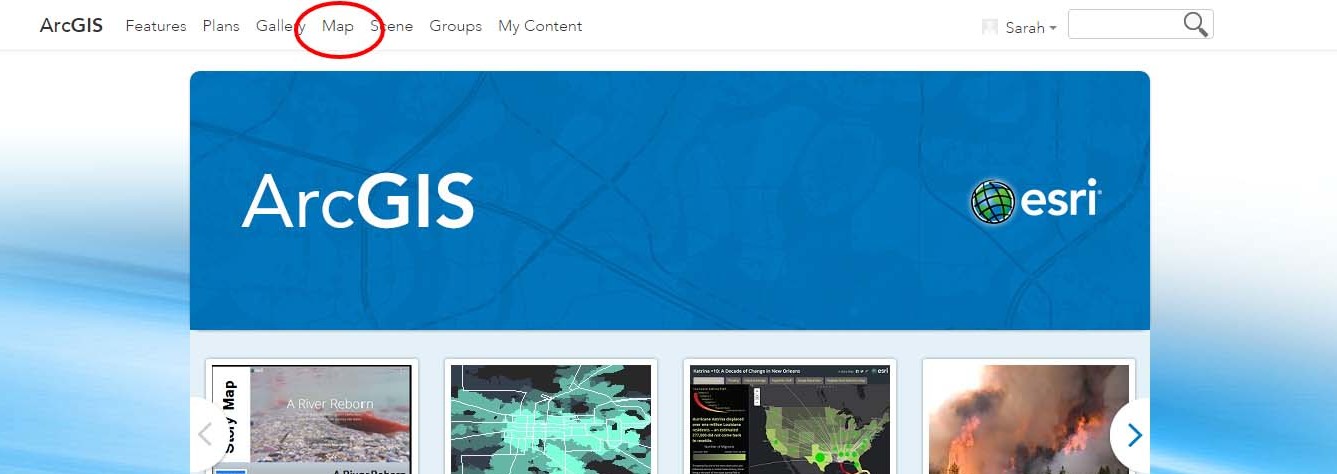
3. You’ll be taken back to the home screen, so click “Map” at the top of the page. This takes you to a base map of the United States with details on the left column.
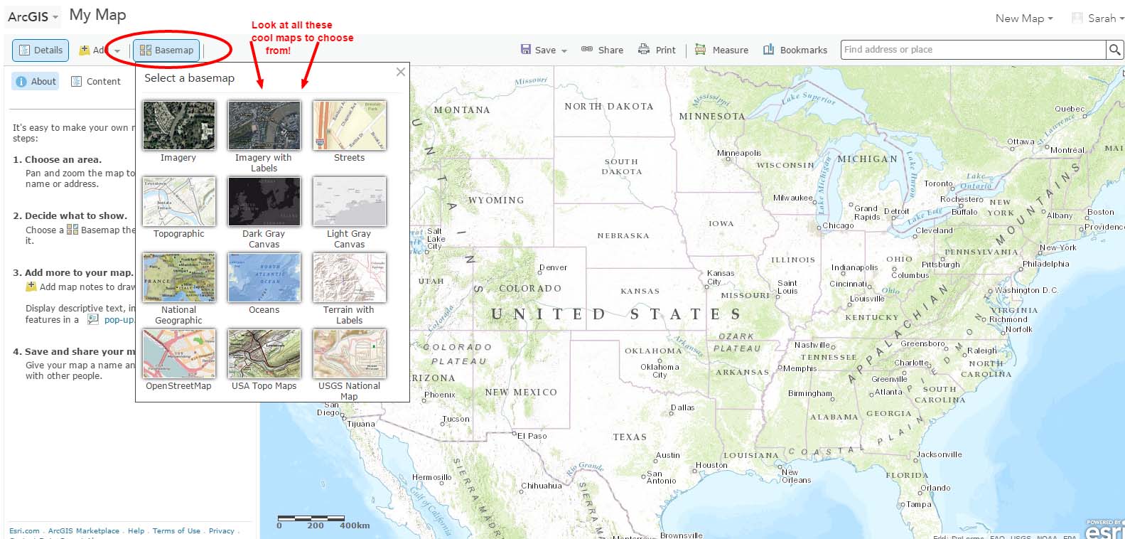
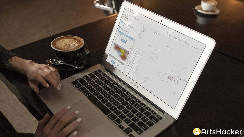
4. Choose your basemap. The basemap is the foundation of your map; it’s what the data will be placed over. There are several different maps to choose from, but my favorites are the topographic one (this is also the default map that appears when you create a new map) and the one I chose for this example, the light gray canvas map. You can go back and change this later if you decide your data points look better on another basemap.
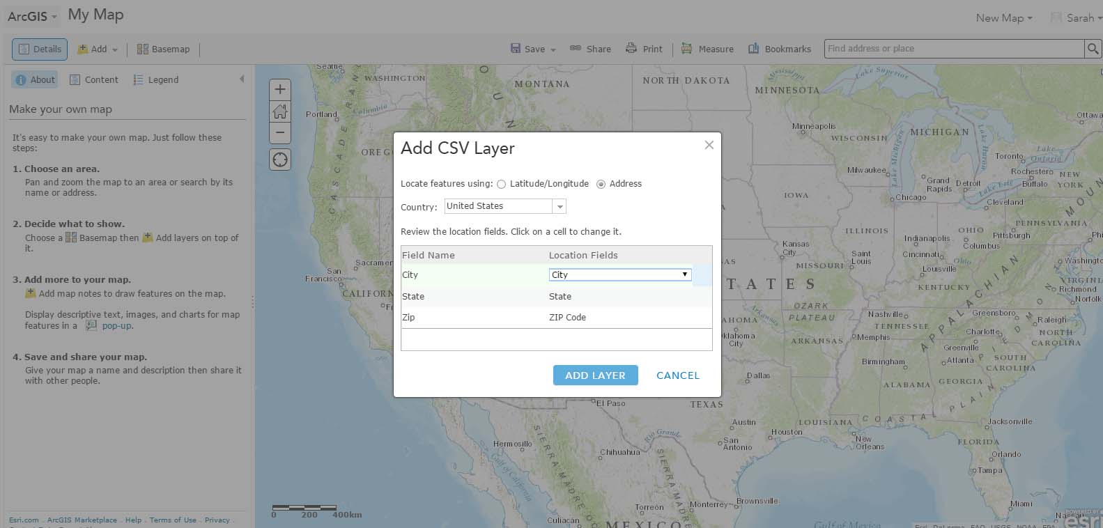
5. Click “Add” at the top of the left hand column, then click “add layer from file”. It is possible to pull in a “layer” (or a set of data points that is all grouped together) from the web or from other users, but most often, I’m working with organization specific data. Clicking add layer from file opens a box allowing you to choose a ZIP, TXT GPX, or CSV file. The catch here is that your CSV file can only have 250 lines in it, so you’ll need to clean your data before uploading it and choose what’s important or compact the information into 250 lines.
After clicking “import layer”, you’ll see a box that let’s you match fields. Unless you’re really fancy and record the latitude and longitudes of your audience members or education locations, you’ll be working with a standard address. Make sure the fields line up and click “Add Layer”.
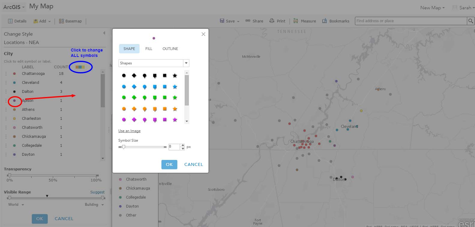
6. The locations will appear on your map with a legend. Now, you can change them.
You’ll see in the left hand column a drop down box where you can “change the attribute to share”. Switch back and forth between your headers, likely between city, state, and zip, until you have what you want displayed. In this example, I wanted the cities to be displayed.
Choose how you want the data displayed. You’ll want to think about what the end point of your map is and what exactly you’re trying to display and which story you’re telling.
- Types (unique symbols): best used if your data is discrete and each place is different. Here, we’re showing different cities that we work in which end up being different colors.
- Heat map
- Location (single symbols): best used when your data points are all the same types of things like zip codes of recent attendees. A few years ago, I did a map showing where our musicians taught around the region and country. It was all the same type of data and I was mostly interested in showing the broad scope of where they taught, not the individual locations.
To change the default icons, click “Select”. This then displays the categories by their symbols, names, and counts. You can type in different labels or counts in the columns if you like. To change the color, size, or shape of the icon, click on the icon itself which then opens up a box where you can choose from a variety of different symbols, change the size, and change the color. I like to match our colors to our organization’s color palette. #nerdalert
*You can change all the symbols at once by clicking on the tricolor icon at the top of that column.
7. Add other layers. You can add additional layers by following steps 5 and 6. However, be careful of adding too much data. The point is to tell a story; does your additional layer help tell the story or make it more clear? I often find that one layer is very sufficient for my visual display.
8. Finishing up. Click “Save As” at the top of the map and name it. You’ll also need to add at least one tag (I almost always use “symphony”) and click save. From there, you can share it online, embed it in a website, or print it. The one hitch to the system is that there’s not an easy way to save it as an image file. I end up taking a screen shot, cropping, and saving as an image that way. Your computer settings may let you save it when you go to print it. It’s an issue, but since it’s a free program and there are several work-arounds, it’s not too big of an issue for me.
9. Share the brilliance. Use it in annual reports, on your website, in funding requests, and any other way you think will be helpful. I’ve found that sharing it on social media returns huge bumps in engagement.
Congratulations, you are now a Map Nerd. We’ll get buttons.
Thank you for the authoritative read on this issue. To me, being able to actually see the icon in the…