This series is designed to help those working in the arts and culture sector apply user experience (UX) best practices to daily content management tasks. Using Jon Yablonski’s collection at LawsOfUX.com that gathers best practices designers consider when building user interfaces, today’s installment will focus on the Zeigarnik Effect.
The Zeigarnik Effect
Per lawsofux.com/zeigarnik-effect, here’s how the Zeigarnik Effect is defined:
People remember uncompleted or interrupted tasks better than completed tasks.
- Invite content discovery by providing clear signifiers of additional content.
- Providing artificial progress towards a goal will help to ensure users are more likely to have the motivation to complete that task.
- Provide a clear indication of progress in order to motivate users to complete tasks.
Origins
Bluma Wulfovna Zeigarnik (1900 – 1988) was a Soviet psychologist and psychiatrist, a member of the Berlin School of experimental psychology and Vygotsky Circle. She discovered the Zeigarnik effect and contributed to the establishment of experimental psychopathology as a separate discipline in the Soviet Union in the post-World War II period. In the 1920s she conducted a study on memory, in which she compared memory in relation to incomplete and complete tasks. She had found that incomplete tasks are easier to remember than successful ones. This is now known as the Zeigarnik effect. She later began working at the Institute of Higher Nervous Activity which is where she would meet her next big influence Vygowski, and become a part of his circle of scientists. It was also there that Zeigarnik founded the Department of Psychology. During that time, Zeigarnik received the Lewin Memorial Award in 1983 for her psychological research.
This is an excellent example of a UX law that helps dictate how to construct a multi-part process, let’s look at some real-world examples.
Multi-Step Process For Gathering Information
There are numerous online examples where the Zeigarnik Effect can help improve multi-step processes, which by their very nature can discourage user participation if the user feels like the process is unnecessarily long or requires them to leave the process to gather information.
Creating a new account and event/class registrations are two common components but I’m going to use a more challenging example: the process for a new ticket buyer to select a reserved seat ticket.
It’s rare for nonprofit performing arts organizations to spend much time designing their online ticket experience around the new ticket buyer. When designing UpStageCRM, we made sure to rectify that oversight by creating a user test group comprised entirely of individuals that have never purchased a ticket to an arts and culture event. The results were fascinating:
- Traditional top-down or isometric seating map user interfaces left new ticket buyers feeling confused because they felt the process assumed they already had information about the venue.
- A detailed seat filter that provided the ability to display available seats based on quantity, price range, location, and several specific seat preferences helped, but conversion rates were only ~10% higher than the seat map only interface.
- The option that produced the highest conversion relied on putting the Zeigarnik Effect into motion by way of creating a multi-step narrative driven process that allowed ticket buyers to discover seats and select with the highest degree of confidence.
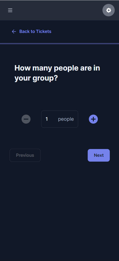
Step 1: Quantity
The process begins by asking users how many people are in their group. Note the conspicuous “Back to Tickets” link above the progress bar.
We discovered that providing a way to exit the process before completion was critical to preventing user frustration over being forced through a process.
Step 2: Prioritization
There are three remaining paths in the process ticket buyers can complete. But instead of forcing a specific option, we embraced the discovery aspect of the Zeigarnik Effect and designed the process so they controlled the order.
Asking the ticket buyer what’s most important to them created the strongest conversion result along with the highest satisfaction levels at the end of the process.
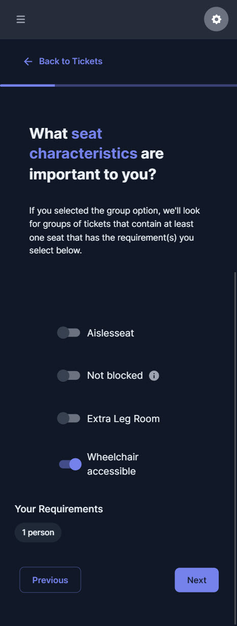
Step 3: Highest Priority Criteria Selection
In our system, each organization can assign up to five seat characteristics per event. Those are then provided to the ticket buyer to help narrow down seat options that most valuable based on their desired.
Adding tooltips was crucial to helping new ticket buyers feel confident in their selections.
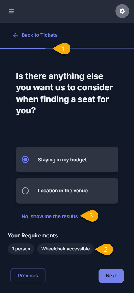
Step 3: Subsequent Criteria Selection
The ticket buyer will be offered the opportunity to go through each remaining option and instead of forcing them through the process, providing a few key pieces of information will help reinforce that artificial progress toward the goal of finding their ideal seat.
- At each step in the process, the progress bar provides clear indication of progress.
- We discovered providing an overview of selected requirements more than doubled the ticket buyer’s confidence throughout the process.
- Providing ticket buyers with an option for “getting to the point” was another invaluable lesson.
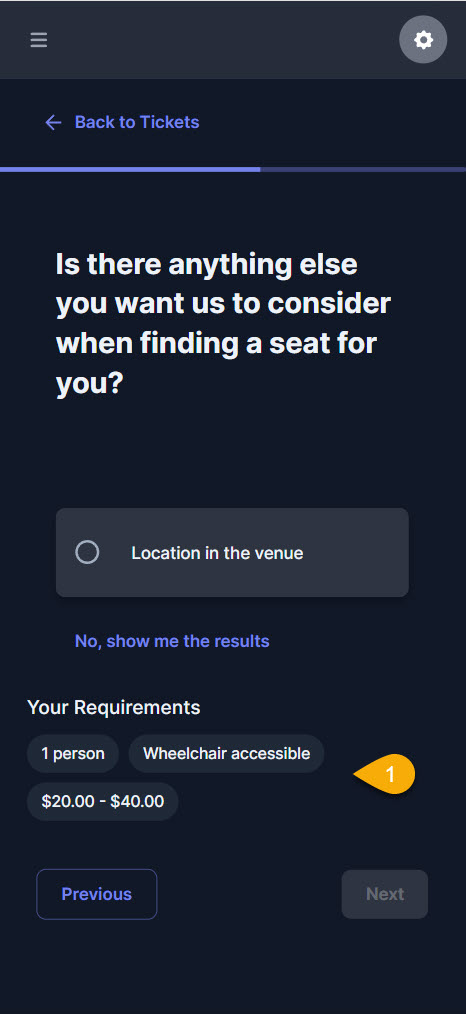
It’s worth pointing out that asking ticket buyers about their budget for tickets instead of how much they want to spend didn’t decrease the likelihood of them buying tickets at the higher price points. But showing the full range and offering the option of including taxes and fees produced higher conversion results.
- After each selection, the ticket buyer sees the system taking their selections into account.
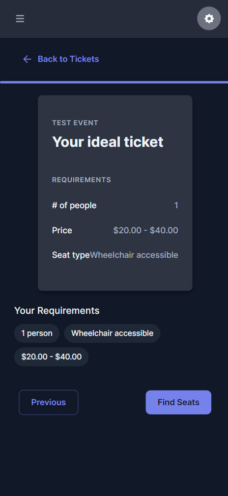
Step 4: Review And Preparation
Regardless of whether the ticket buyer opted to complete every possible step in the process or skipped to the end, the system confirms their options and allows them to amend or continue.
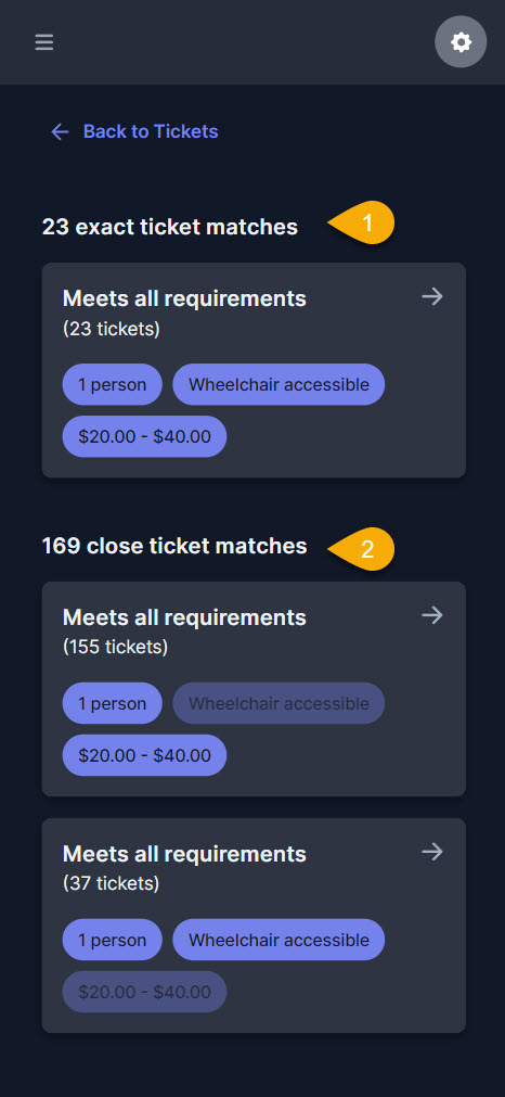
Step 5: Results
We discovered that new ticket buyers developed a much higher degree of trust when we presented more than just the tickets that are exact matches.
- Clearly labeling the total number of seat options that meet 100% of their requirements helped trigger emotional satisfaction.
- Providing additional options meeting some of their criteria built trust and reinforced that the process is indeed designed for their benefit. At this point, the user could select any of these options over the exact matches if desired.
We dubbed this step of the process the “joy moment” when the ticket buyer feels that tiny rush of emotional satisfaction from seeing the system accommodating their preferences instead of forcing them into seats the organization wants to push.
That joy translated into higher conversion rates with ticket buyers feeling confident and satisfied with their purchase.
Once the ticket buyer clicked past this point in the process, they would enter the familiar seating map interface with their options highlighted. At this point, if the organization added the content, the ticket buyer could view the stage from their seat or bookmark favorites to compare before purchase.
Show Yablonski some love and order one or more of the posters he designed for each practice covered at lawsofux.com, which is completely free to use. You can purchase them at his online store.



Thank you for the authoritative read on this issue. To me, being able to actually see the icon in the…