It is a proven fact that having an optimized CTA button on your landing page, website, or email drives engagement. However, we tend to use the same text over and over again. “Buy Tickets.” “Subscribe.” “Donate.” Maybe “Donate Here.”
Pretty boring, right?
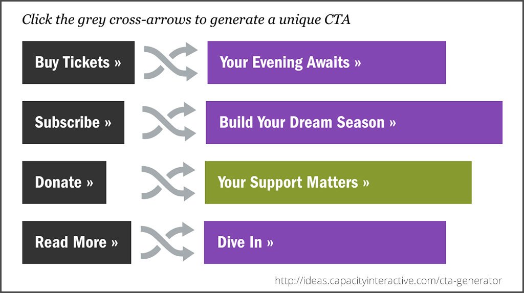
Well, our friends over at Capacity Interactive have published a great little tool to spice up your CTA buttons.
I know from personal experience that having the right text on that CTA button can dramatically increase clicks. A few years ago, at Palm Beach Opera, I wasn’t getting very many clicks on the CTA button in my ticket sales emails so I experimented a bit with the text to see what would work better. (Of course, I’m kicking myself that I didn’t do a proper A/B test to be able to show you legit data. You’ll just have to trust my anecdotal data just this once.)
Traditionally, my CTA button had the traditional “Buy Tickets” on it. Upon further thought, I realized that sometimes this can seem a little bit harsh and permanent. So, I changed the button to say “View Available Seating” and the number of clicks increased dramatically. Just this slight change had a big result.
If you’re like me, sometimes we need a little boost of creativity to make our CTAs really pop. Perhaps not all of Capacity’s suggested options are right for your organization, but this handy tool is a great place to get some inspiration.
Let this be the end of boring CTAs! Try the CTA Generator here –>