Did you know that a routine boilerplate included in many grant agreements stipulates the receiving organization agrees that their website complies to accessibility standards? Granted, I have yet to see a funder yank a grant for failing to comply, but that doesn’t mean you should bury your head in the sand. Fortunately, we’re going to look at a couple of free tools you can use to help you meet and exceed recommended accessibility standards.
What Are Web Accessibility Standards?
If you aren’t already familiar with web accessibility standards, drop by the Web Content Accessibility Guidelines (WCAG) 2.0 site. Although not overwhelming, there is a good bit of material there, some of which you’ll need to speak with your developer about. At the same time, there are some critical elements that are very easy for anyone to check, such as color contrast is distinguishable for visually impaired site visitors.
[box]Handy Resource: you can find a thorough WCAG 2.0 compliance checklist at https://webaim.org/standards/wcag/checklist [/box]
Simple Color Contrast Checker
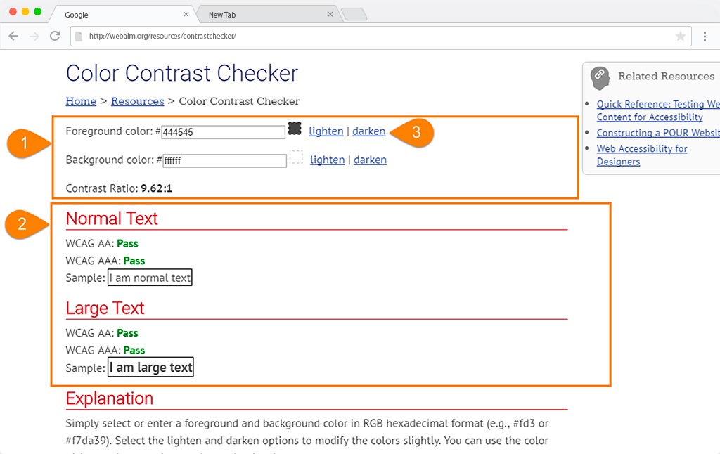
Webaim.org’s color contest checker is as straightforward as it gets. You plug in two colors via their six-digit hex code value and they’ll show you if the contrast between the two passes WCAG2.0 standards.
- Enter the hex codes for foreground and background colors.
- Confirm if the contrast is enough at regular and large font sizes to pass.
- If any item triggers a “fail” select the “lighten” or “darken” options for either option until the fail is cleared. The system will automatically generate the new hex codes if you need to copy.
Wave Accessibility Evaluation Tool (WAVE)
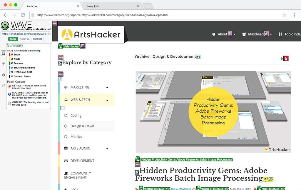
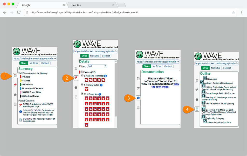
If you need to dive in deeper, WAVE is a tool you can use to check an entire webpage for the WCAG 2.0 compliance. Just punch in the URL and it does the rest! You’ll see a number of icons marking items of note along with a left sidebar that provides a results overview. Selecting any icon will produce a popup with additional information.
- Summary tab
- Details tab
- Documentation tab
- Outline tab
For most users, the first two tabs will produce the most actionable info.
You’ll also notice that you can view the page with native styles, styles filtered out, or with a color contrast checker activated that works much like the one from Webaim.org.
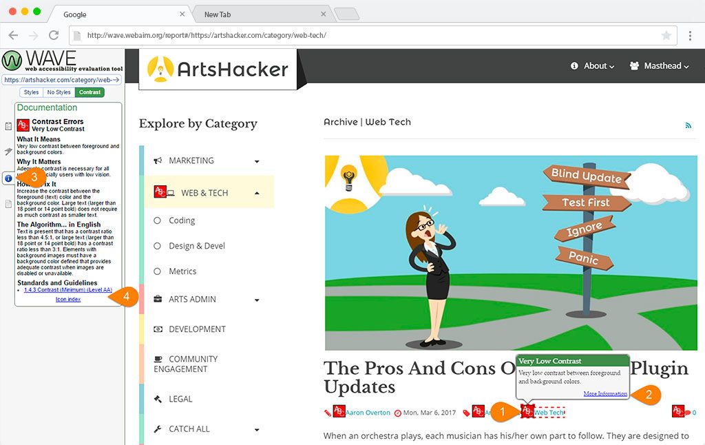
The site provides a wealth of interconnected reference material, for instance:
- If one of your elements triggers a low contrast alert…
- selecting the “more information” link will open…
- the “Documentation” sidebar tab which in turn…
- often includes a corresponding link to the compliance checklist referenced above.
Simply put, “I didn’t know” will never be an excuse!


Thank you for the authoritative read on this issue. To me, being able to actually see the icon in the…