In November, 2018 we examined how you can move toward better web accessibility by focusing on improved color contrast. If you’re starting to get into a groove on those tasks, you probably realize the back-and-forth grind for checking colors can become a bit of a drag.
Fortunately, there’s a Chrome extension designed for frontend developers that is so straightforward, anyone can use it. Since it’s baked right into the browser, you can conduct all your color contrast tasks right on the webpage you’re reviewing! It comes in both free and fee-based versions but really, at $4.99, the paid version is a steal.
Kontrast from getkontrast.now.sh allows you to quickly check and adjust contrast in real-time in your browser to meet Web Content Accessibility Guidelines (WCAG) 2.1 requirements.
Once installed, you can activate via the extension icon anytime you’re ready to check element contrast:

An options panel will slide up from the bottom of your browser window. On the first use, be sure to check the extension settings:

- Select the settings icon
- Here are options I typically use but some frequently modified versions will include deactivating the “Ignore:hvoer style” when checking links or any other element with hover actions.
Now you’re ready to begin testing contrast.

- Select the “Inspect” button.
- Hover over any page element, you’ll notice available sections will have a red border and semi-transparent overlay color. Select the one you want to test and the results will appear immediately in the Kontrast panel below.
- In this example, the body text font color passed through the strictest WCAG setting.
If you have an element that fails, no worries. This is where Kontrast adds some serious value to the process in that it can automatically provide a recommended option that most closely matches the original color but passes contrast standard.

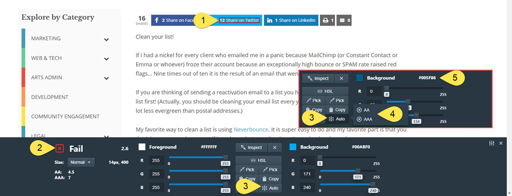
- Let’s select the Twitter share button.
- It turns out the white font color over the default Twitter blue fails (#BooTwitter).
- Since white can’t get any whiter, let’s see about adjusting the background color. Select the “Auto” icon on the “background” side of the panel results.
- A popup will appear where you can opt to have Kontrast select a color that meets AA or AAA WCAG standards.
- In this example, I selected “AAA” and according to Kontrast, the background color will need to change from #00ABF0 to #005F86
Rinse and repeat across as many elements on as many pages as you like.
You can do quite a bit more with Kontrast, and I encourage you to do exactly that, but this will get you up and running on the fundamental tasks related to checking color contrast.
Thank you for the authoritative read on this issue. To me, being able to actually see the icon in the…