Tomorrow, 4/21/2015, is the day Google will fully implement the latest major change in its search algorithm and if your site isn’t prepared, you can expect a world of hurt via your search rankings. Simply put, it’s all about meeting Google’s new mobile friendly thresholds; if your site is what Google considers mobile friendly it is more likely to rank it higher in search results.
Additionally, Google also plans to contain more relevant mobile content via those new standards in search results. A post via Google’s Webmaster Central blog from 2/26/2015 provides additional details (emphasis added).
Starting April 21, we will be expanding our use of mobile-friendliness as a ranking signal. This change will affect mobile searches in all languages worldwide and will have a significant impact in our search results. Consequently, users will find it easier to get relevant, high quality search results that are optimized for their devices.
Even more info is available via Google’s initial announcement from 11/18/2014.
Fortunately, Google also provides some tools you can use to help determine if pages within your site meet their threshold for a mobile-friendly design. Here’s a step-by-step guide covering what you need to do:
Step #1
Don’t Panic.
Step #2
Visit https://www.google.com/webmasters/tools/mobile-friendly
Step #3
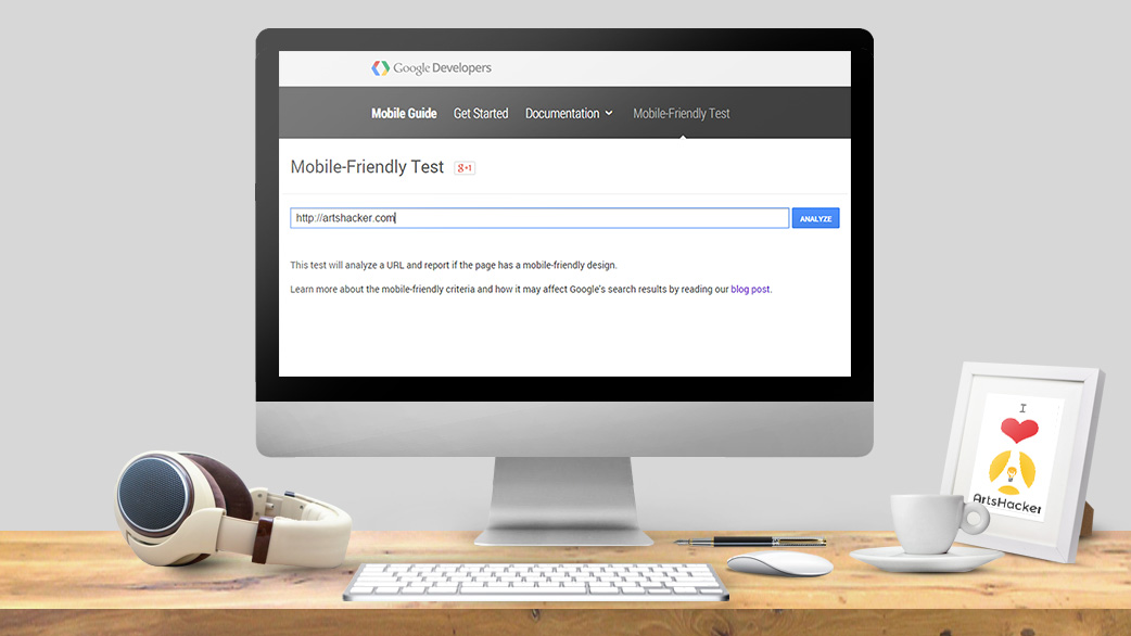
Enter the full URL for the page you wish to test and click the blue “analyze” button. Google will then chew over everything via that URL and load a results page letting you know how everything turned out.
PRO TIPS:
- Google analyzer is not a tool to evaluate an entire website, only individual pages; consequently, make sure you analyze pages that contain any table based content or forms, such as newsletter subscriptions, event calendars, and e-commerce transaction pages.
- Check any pages that use copypasta* embedded content (such as traditionally mobile unfriendly content like old school Issuu code).
- Many groups maintain separate sites for the main website and box office so make sure you check the latter’s pages as well.
- Make sure you don’t get fooled by false positives; for example, if you use a third party provider to generate your web content for platform specific mobile devices, Google may return an a-ok message but you’ll notice an error screen in the associated screencap along with some warnings about temporary error messages (like this example from the Detroit Symphony’s event calendar webpage). In cases like this, there are likely issues that need to be explored in greater detail.
[twocol_one]

[/twocol_one] [twocol_one_last]

[/twocol_one_last]
Conclusions
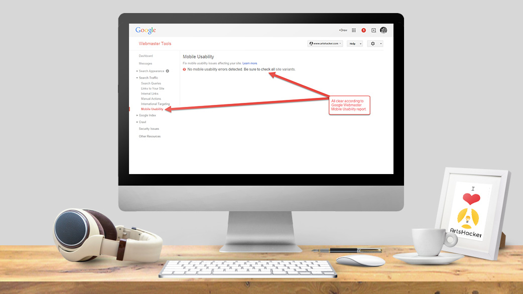
Although Google’s mobile-friendly analyzer is an excellent launching point, it doesn’t mean you should stop there; instead, your next step is to swing by your site’s Google Webmaster tools and check the Mobile Usability report for any error or notices. If you don’t have a Google Webmaster account, take the time to set one up and connect it with your Google Analytics account. In fact, that’s probably a good topic for another day…
[box type=”info”]*A block of code and/or text that gets copied and pasted from one source into another. Usual suspects include iframe code, HTML, and related scripts.[/box]