Creating image alt text is one of the more time-consuming and challenging content management tasks to complete. It is also one of the most rewarding so always know that the time you put into it pays off.
Web content accessibility is an increasingly important topic and if it isn’t already on your radar, it should be. At the heart of accessibility are the Web Content Accessibility Guidelines (WCAG), a central element of a series of web accessibility guidelines published by the Web Accessibility Initiative of the World Wide Web Consortium (W3C), the main international standards organization for the Internet.
While there are many standards that must be addressed by your developer, the good news is regardless of technical skill level, something like image alt text is something content mangers can address.
Per the guidelines from w3.org, here’s what image alt text is all about:
Images must have text alternatives that describe the information or function represented by them. This ensures that images can be used by people with various disabilities. This tutorial demonstrates how to provide appropriate text alternatives based on the purpose of the image.
Adding images without using appropriate alternative attributes (alt tags), can be extremely frustrating for people with visual impairments using assistive technologies, such as screen readers. Alt text descriptions add valuable information for those screen readers.
Today’s post is going to focus on managing alt text via the WordPress publishing platform as it provides one of the most comprehensive ways to add and edit image alt text. Having said that, most other platforms provide similar means for managing alt text and you should refer to their documentation on how to go about that process.
An Overview Of WordPress Image Fields
When uploading or editing an image in WordPress, you’ll have the option to edit the following fields:
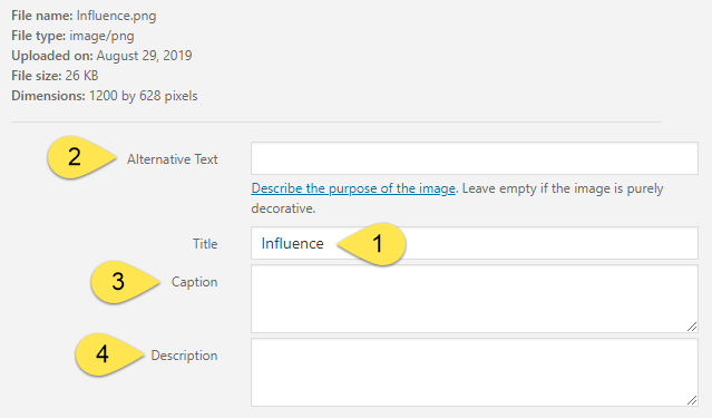
- Title Field: used mostly as an internal resource and by default, adopts the file name. It can be changed at any time.
- Alt Text Field: This is the critical field for accessibility. As a bonus, it has just as much importance when it comes to the image being read by search engines, meaning, it has the most SEO impact of all image fields.
- Caption Field: the system displays this content on the frontend when the image is inserted into page content.
WordPress Tip: there are some areas where a caption does not show such as featured images. - Description Field: this is an odd-ball field used more by WordPress than other publishing platforms. By and large, you can leave this blank as it only becomes applicable if you use WordPress’ image attachment pages. And if you aren’t sure if you do, it’s a safe bet you probably don’t.
Determining What To Use For The Alt Text Field
This is where things get interesting and there’s no single “do this” type of guidance. Ultimately, it depends on several variables such as how the image is used.
The most efficient approach is to use a decision tree,
First, bookmark the following link from the Web Accessibility Initiative, (they are the go-to source for these standards): https://www.w3.org/WAI/tutorials/images/decision-tree/
You’ll find a remarkably useful decision tree you can use to determine which actions you should take.
We’re going to cover each of the steps in that tree along with providing some samples more applicable to performing arts orgs.
Step 1: Does the image contain text?
This is something most groups will find in their media library. Embedding text directly into images was a common practice, and for many groups it still is. Events are prime suspects and if there is text, the decision tree will walk you through the following options (you can expect #1 and #4 to be most common):
- …and the text is also present as realtext nearby. Use an empty alt attribute. See Decorative Images.
- …and the text is only shown for visual effects. Use an empty alt attribute. See Decorative Images.
- …and the text has a specific function, for example is an icon. Use the alt attribute to communicate the function of the image. See Functional Images.
- …and the text in the image is not present otherwise. Use the alt attribute to include the text of the image. See Images of Text.
Step 2: Is the image used in a link or a button, and would it be hard or impossible to understand what the link or the button does, if the image wasn’t there?
A common application will be something like event lists and calendars as well as something like image grids of artists.
In the following example, the event image links through to the single event page so this image would definitely qualify for this condition, as would all the images from the full event list.

For these images, the guidelines only have one option to consider:
- Use the alt attribute to communicate the destination of the link or action taken. See Functional Images.
Step 3: Does the image contribute meaning to the current page or context?
For most of you, your images will fall into this type of usage. The vast majority will be option #1 below but something like a seating chart, like the example below, would qualify for option #2.
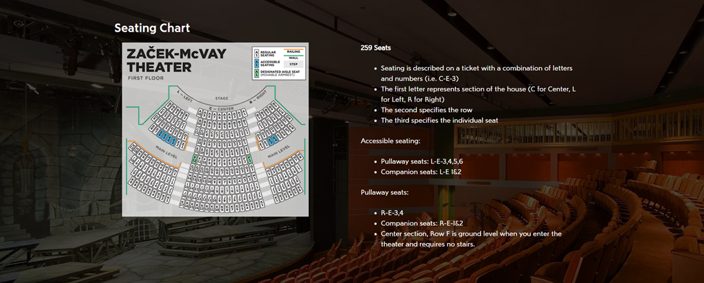
These options are something you’ll want to revisit a number of times until they become internalized:
- …and it’s a simple graphic or photograph. Use a brief description of the image in a way that conveys that meaning in the alt attribute. See Informative Images.
- …and it’s a graph or complex piece of information. Include the information contained in the image elsewhere on the page. See Complex Images.
- …and it shows content that is redundant to realtext nearby. Use an empty alt attribute. See (redundant) Functional Images.
Step 4: Is the image purely decorative or not intended for the user?
If most of your images fall into this category, consider yourself fortunate because all that’s requires is leaving the alt text field empty.
In short, if you could remove the image and it would have no impact on what a screen reader has to deliver, it can fall into this category.
A great example is this site, where most of pages feature big, full width background images set behind functionality content.
The single option provided in the decision tree links through to some additional examples.
- Use an empty alt attribute. See Decorative Images.
Step 5: Is the image’s use not listed above or it’s unclear what alt text to provide?
Hopefully, the previous conditions will cover all your images alt tag scenarios. If not, the decision tree provides the following overview to see if the unknowns fall into any of these outlier conditions: https://www.w3.org/WAI/tutorials/images/
Practical Tips And Tricks
In addition to the decision tree resources, w3.org provides several practical tips to help out:
Imagine that you’re reading the web page aloud over the phone to someone who needs to understand the page. This should help you decide what (if any) information or function the images have. If they appear to have no informative value and aren’t links or buttons, it’s probably safe to treat them as decorative.
The alt text should be the most concise description possible of the image’s purpose. If anything more than a short phrase or sentence is needed, it would be better to use one of the long description methods discussed in complex images.
Additional Tips:
- Punctuation is your friend: adding spaces at the beginning of the alt text description will help screen readers distinguish where that content begins.
- Don’t describe images like icons with the alt text “icon.”
- If you consider beginning alt text descriptions using “picture of” or “image of.” Screen readers already announce images as images so including those phases comes across like a digital stutter. Visually impaired readers as they would hear something like “image, image of composer Jennifer Higdon.”
- Avoid using images of text. #obvi
Last But Not Least: Logos
One commonly overlooked image is the logo used in the site header.
Most websites automatically add a link to the main site logo back to the home page. While you may encounter slightly different perspectives, providing alt text for the image that is simply your organization’s name will usually suffice.
You do not need to describe it as a logo but if you’re looking to err on the side of caution, you can include a description that indicated the image is linked back to the home page. For example, alt text such as “Big Boy Symphony Orchestra home page” works.
Here Is Your Accessibility Through Content Management Action Item
Start going through all the images in your media library and adding appropriate alt tags.
I know, this is probably an enormous task for most of you so it’s something you’re going to have to plan for. Bringing in volunteers, interns, and additional hands from other departments may be necessary.
It will take time and don’t be discouraged if you must go back and edit some after the fact. There will be a learning curve and you should absolutely treat yourself and your team to something nice when the task is completed.