I’m sorry but it’s true.
Most arts organizations have some sort of slider feature (also called a carousel) on their website. You probably do right now. Well, the cold hard truth is that very few people are actually seeing that slider content.
How do I know this? DATA. (No, not this Data. I’m talking about real facts that have been collected and analyzed over time.)
I think it makes us (meaning arts marketers and arts administrators) feel better to have a slider of some sort on our website but that doesn’t mean that it is effective.
A couple of years ago, the folks at Notre Dame did a study on this and here’s what they found. Only about 1% of people click on a slider feature on websites. Of these clicks, 84% were on the first slider feature.
Ok, let’s take a second for that to sink in…
So, now that we’ve accepted the fact that no one is even looking at let alone clicking on our slider features, what do we do about it? We’ve got some awesome things going on that we want to feature there to make sure people see them. What do we do?!?!?!?
Let’s totally rethink the point of the slider for a second. The information there is related to very important shows/programs/information, right? Let’s figure out a better way to get people to do what we want them to do upon getting to our website.
1. Switch to a hero image with a clear and prominent CTA.
A couple of seasons ago at Palm Beach Opera*, I moved to this design from a more traditional slider and the number of clicks on the CTA button improved dramatically. This option is probably the easiest to implement on your website (especially if it is running on WordPress).
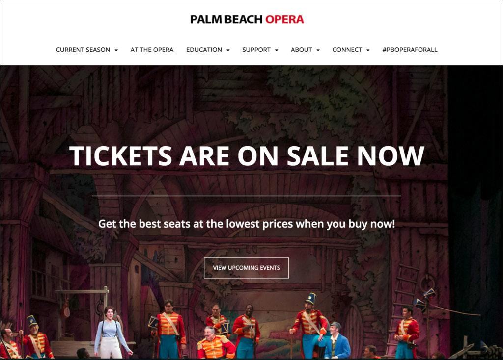
When I thought about it, the point of that slider for me was to get people to see all of our events. That large CTA button linked to a page with all of those events listed (with an image) in chronological order. (Yes, it was a bit scary to make this switch but, luckily, my General Director was incredibly supportive of us trying something new.)
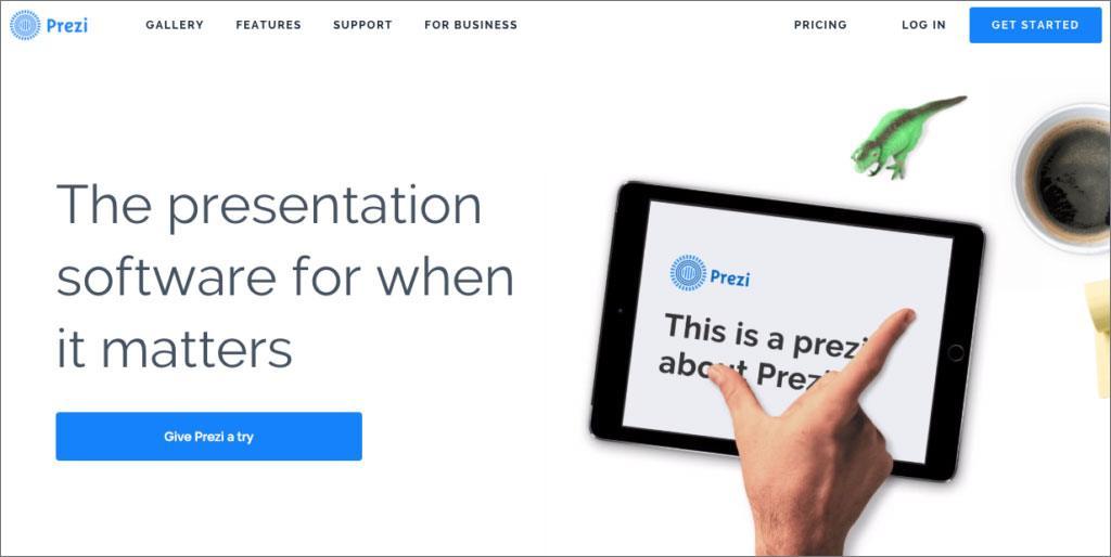
Here are some other non-arts samples of this approach:

2. Run a slideshow or video behind the content
This approach enables you to still feature all of that great production photography you have but still keep the same copy and CTA to ensure people see what you want. My favorite nonprofit example of this is from the Nashville Zoo. Here’s a screenshot but you’ve really got to go to their website to see it for yourself.
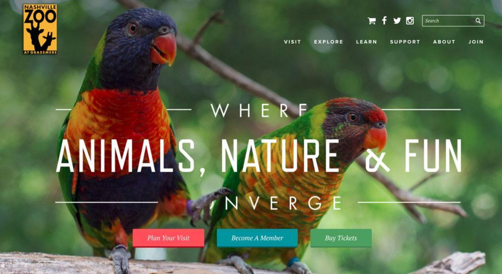
It is clear from this homepage that they have three main actions they want people to take: plan a visit, become a member, and to purchase tickets. They are so clear right when the page loads and remain throughout the slideshow behind.
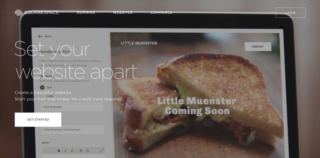
Squarespace also does this same sort of thing using video (albeit with just one CTA):
3. Go totally custom
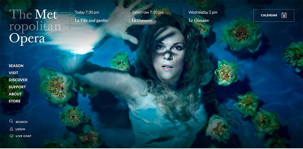
Recently, The Metropolitan Opera redesigned their website and, whilst initially it featured large hero videos, at some point in the past few months, they switched over to a modified sprite carousel. This is a custom option but it is so effective because the background images automatically switch out when you start to scroll so you can’t help but see all of them.
I challenge you to broaden your thinking on how you can better facilitate clicks on your homepage. I’d love to know how it turns out!
(PS – If you’re looking for ways to definitively see how people are really interacting with your website, I highly recommend this and this.)
*NOTE: I was the Director of Communications at Palm Beach Opera until the end of December 2015.
Thank you for the authoritative read on this issue. To me, being able to actually see the icon in the…