Three Ways You Can Prevent Frustrating Design Problems When Working With Portrait And Landscape Images

Published:

By: Drew McManus

In: Design & Branding

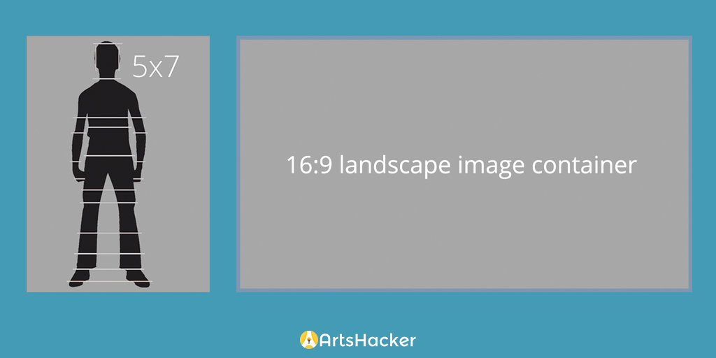
One common frustration when creating web content is trying to fit portrait aspect ratio photos into a landscape aspect ratio container, such as a landing page slider or something like a standardized event image template. It is the digital image equivalent of pounding a square peg into a round hole but here are three solutions you can use to help solve, and even prevent, this aggravation.

THE PROBLEM

At the heart of the trouble is the need to fit an image that is taller than it is wide (portrait) into a space that is wider than it is tall (landscape).

The Problem
Square Peg, meet Round Hole; Round Hole, meet Square Peg.
More Problems
In order to fit the portrait image into the landscape frame so that all of it is visible, you end up with a large amount of dead space regardless where the image is located within the landscape container.
all of this content is lost
But if you increase the width of the portrait image to match the width of the landscape container, you end up cutting off more than two thirds of the source image.

SOLUTION #1: THROW MONEY AT IT

If you left room in your budget for custom graphic design work (smart move), the easiest solution is to have your in-house or outsourced designer work some Photoshop magic on the image so as to embed it into a custom graphic design solution.

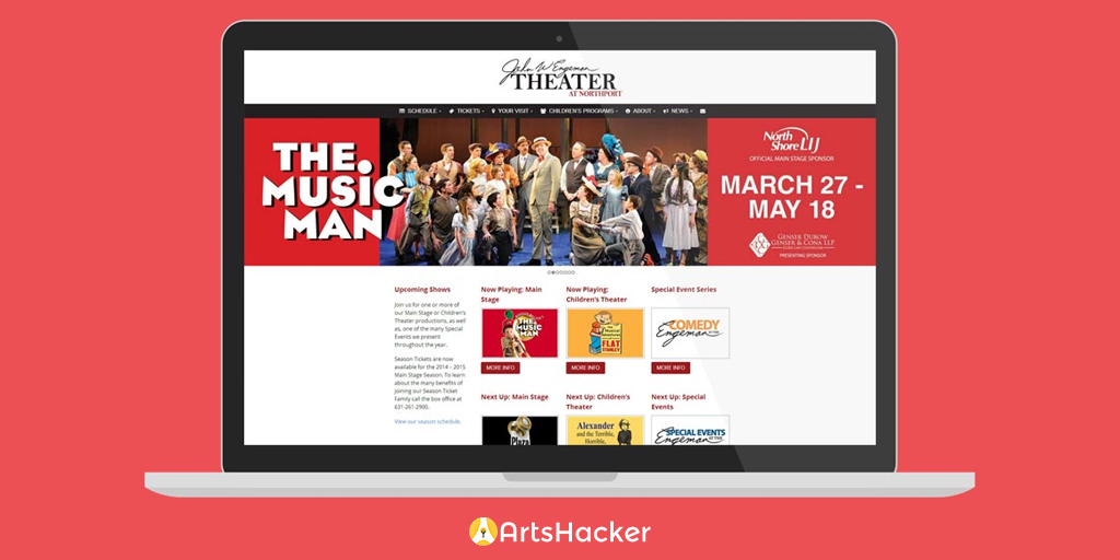
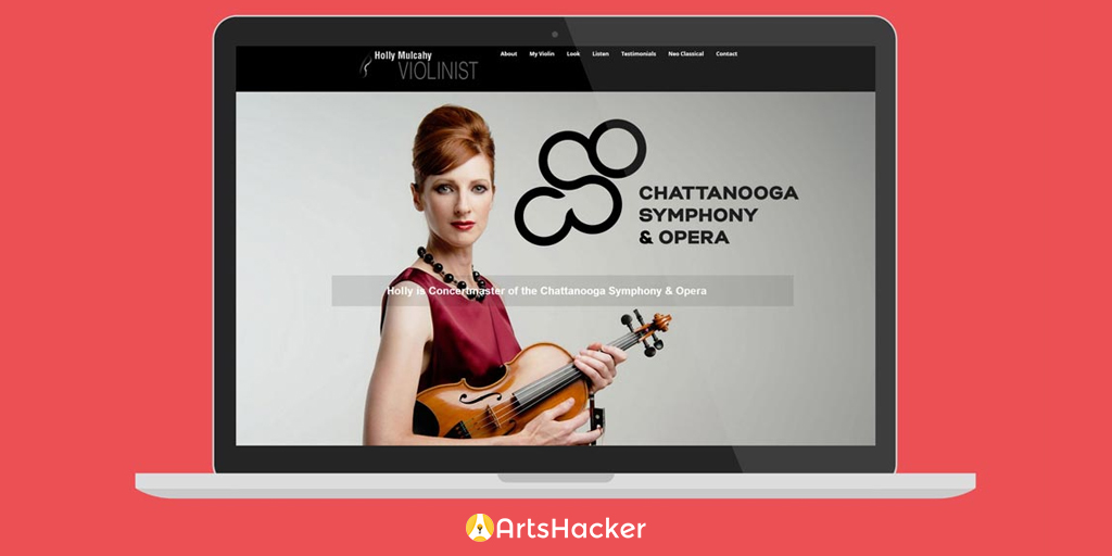
In this example, EngemanTheater.com actually had a landscape image but they didn’t want to lose any of the original photo to match the slide’s aspect ratio. As a result, they had their graphic designer embed it into a custom slide image that also incorporated some of the show’s corresponding typography.

Engeman Theater

SOLUTION #2: FORESIGHT

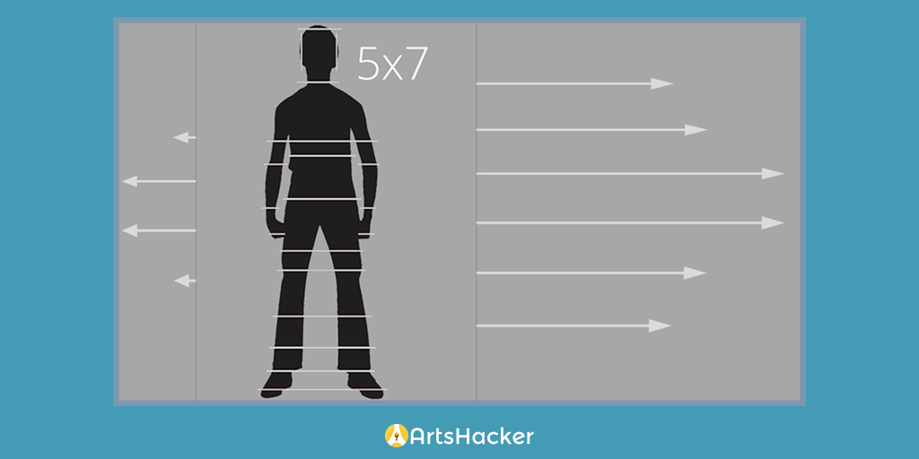
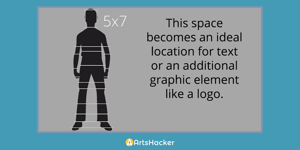
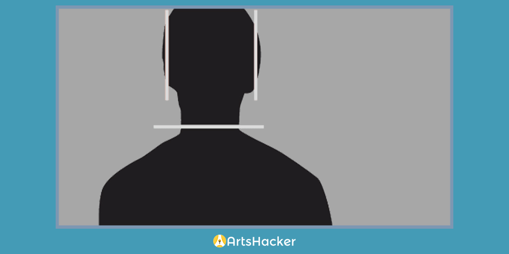
If you have yet to create the source photos, this flexible option is to make sure the photographer takes landscape versions of what would otherwise be your portrait aspect ratio shots. When your photographer is lining up a portrait shot, ask about obtaining an additional shot with the same setup but with enough space in the backdrop on either side to fill up a typical landscape width.

This will maintain the continuity of the portrait image while giving you the ability to use it in far more settings than something like a typical print headshot (not to mention prevent you from inadvertently stifling the photographer’s creativity).

All of that empty space
Here, you can see the alternative version of the original portrait image with the additional space needed to create a landscape version
This space becomes an ideal location for text or an additional graphic element like a logo
The end result is an image that provides the full impact of the original portrait version but leaves room for text or other graphic elements.
Practical Example
Here’s a practical example of this approach via an image from violinist Holly Mulcahy’s website.

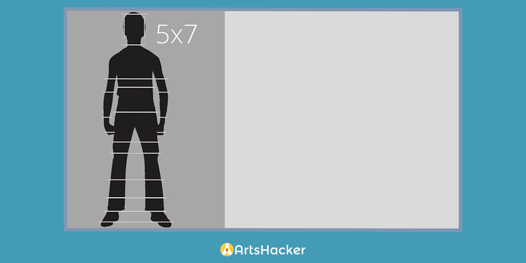
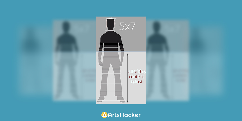
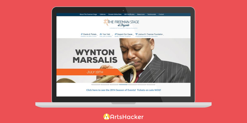
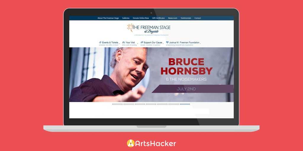
SOLUTION #3: EMBRACE THE CROP

If your images have already been created, consider the benefit of cropping the portrait aspect ratio image to fit inside the landscape container. Granted, this can be easier said than done as most tend to become emotionally vested in the integrity of a portrait aspect ratio image.

Will the final version have the same emotional impact as the original? No, but that’s not a bad thing. The trick is to take yourself out of the frame of mind related to the original portrait image and look at it as an entirely new image. In short, get over your bad self and look at it with fresh eyes.

Embracing the crop
The cropping lines from the original 5×7 sample above came into play here in order to help identify an aesthetically viable cropping point.

When implemented properly, the end result can be spectacular; like these examples from FreemanStage.org which leveraged some serious in-house graphic design skills to come up with the final results.

FreemanStage 01FreemanStage 02FreemanStage 03

So there you have it, three solutions for fixing the square peg in a round hole conundrum when working with portrait images in landscape applications. Ideally, one or more will help you refine your organization’s website.

Drew McManus
Author
Drew McManus
In addition to my consulting business, I'm also the Principal of Venture Industries Online but don’t let that title fool you into thinking I'm just a tech geek. I bring 20+ years of global broad-based arts consulting experience to the table to help clients break the cycle of choosing one-size-fits-none solutions and instead, deliver options allowing them to get ahead of the tech curve instead of trying to catch up by going slower. With the vision of legacy support strategy and the delights of creative insights, my mission is to deliver a sophisticated next generation technology designed especially for the field of performing arts. The first step in that journey began in 2010 when The Venture Platform was released, a purpose-designed managed website development solution designed especially for arts organizations and artists. For fun, I write a daily blog about the orchestra business, provide a platform for arts insiders to speak their mind, lead a team of intrepid arts pros to hack the arts, lead an arts business incubator, and love a good coffee drink.
Author Archive

3 thoughts on “Three Ways You Can Prevent Frustrating Design Problems When Working With Portrait And Landscape Images”

  1. Thank you for sharing! I usually opt for solution #3, but am still confused about how to accommodate the landscape view required by desktops on pages that are also viewed on vertical mobile devices – my wife has rotation turned off so she gets a squished image. I’m guessing keeping it lean would work – unlike solution #1, perhaps. I’d love to hear your thoughts on this issue.

    Reply
    • I’d say that what you’ve described is closely related but mutually exclusive consideration that comes down to the aspect ratio of the image used. A 16:9 aspect ratio tends to maintain legibility when scaled down to the narrowest Smartphone at portrait orientation. Closely tied to that is making sure to use images that don’t contain embedded text that scales down too small or too much detail. For example, here is one of ArtsHacker’s featured images that uses embedded text as viewed on an iPhone 5 in portrait orientation:

      16:9 aspect ratio image at portrait orientation

      Once you cross the 16:9 aspect ratio to something more narrow, you increase the risk of having the image look too small. In those cases, the solution is found by weighing options related to image design and page layout choices inside a responsive platform (such as filtering out the image display entirely once the browser width crosses a specific size).

      And speaking of a responsive design, if the site you’re visiting doesn’t serve up images via a responsive platform, all of this is moot becasue the images won’t be scaled properly anyway. And you should really ditch whatever framework you’re using and make the plunge into something responsive 🙂

      Reply
    • Great article Drew! To address Stephen’s question, depending on the budget and how good your dev team is, you can can supply an alternative “art-directed” image to be loaded only on mobile devices. In cases where cropping isn’t favorable or important visual details are getting lost we can load a different crop of that same image, or a different image all together. Here’s a quick video describing how it works: https://www.youtube.com/watch?v=QINlm3vjnaY&feature=youtu.be

      Reply

Leave a Reply to Drew McManus Cancel reply