Over the weekend, we rolled out a bunch of updates. The majority are under the hood improvements that’s you’ll experience in the form of snappier performance but here are a few key UX items that will enhance your visitor experience.
Less Is The New More
After pouring over a year’s worth of metrics data since the last major design update, it was clear that consolidating the sidebars into a single location.
- The existing Category nav menu has always been very popular with users and it’s right where you are used to seeing it.
- Likewise, the subscription signup forms get a good deal of regular use and we’ve consolidated the two subscription options so you can now sign up for both at the same time if you like!
- Two other sidebar widgets that remain are the social media profile links and recent comment list.
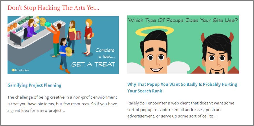
- The Arts Admin job lists that used to be in the footer is now located in the sidebar. It’s grown in popularity with users so we moved it to a location that’s easier to find. We also enhanced the display so it shows Featured listings with description excerpts in addition to the existing job titles for standard listings.
A More Content-Centric Design
On the homepage, post excerpts are more than twice as long and we’ve bumped up the font size and spacing (just a smidge). Single posts are where you’ll see the biggest layout and design changes. You’ll find a full width header area that includes the featured image with the title, date, author, and categories displayed on a semi-opaque overlay.
We also took some time to update our contributor bio pages. You’ll still find a list of all regular contributors via the Masthead but each author now has a mutually exclusive bio page and author archive page.
If You Liked This…
You’ll notice a brand-new related posts function at the bottom of each post. Unlike the previous version, this one is learning what to display based on how you surf through content.
No worries, there isn’t any sort of IP based user tracking going on. Instead, the function is analyzing when users visit more than one page and using that user flow to begin tweaking how it picks and chooses related post content. For example, if site visitors tend to navigate through content based on one type of taxonomy more than another, the system will begin showing posts based on that input.
It will also notice if users tend to follow individual authors and if that’s more of a driving factor than say, categories, the system will place a higher matching value on the former.
What this means is the more you explore and read, the more impact it has on defining relevant content.
A Slimmer Nav Menu, Now With Built-in Search!
We trimmed down the main navigation menu to something more like a traditional silo design, but we kept the sticky placement (meaning, it’s always at the top of the page for you). You’ll also find a new simple keyword search function built right into the menu design.
Just select the search icon, type your search term/phrase into the search box that appears, then select enter and the system will do the rest.
If you need to really drill down with a parameter search, the advanced search page is still available right from the Category Index menu in the left sidebar.