One of the more positive developments in the last decade or so has been the increased investment in research about factors that impact arts and cultural organizations. Even better news, in the last few years those assembling that information have started organizing the data and formatting it so that it is much easier to read and understand.
The 2017 iteration of the Culture Track study we recently wrote about is one example.
Instead of dense sections of text, information has been broken up into smaller segments and are accompanied by visualizations that allow for easier consumption by readers.
However, you still need to be a disciplined reader of the reports to avoid making erroneous assumptions or misinterpreting the data.

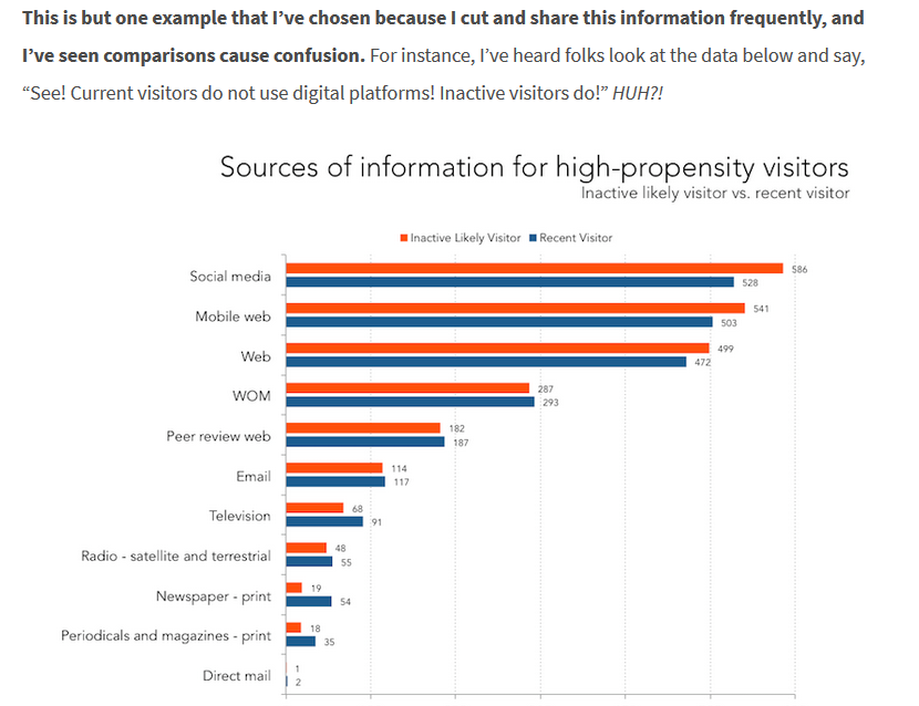
Colleen Dilenschneider who writes the Know Your Own Bone blog, recently listed three ways cultural executive misinterpret research data.
Two of her examples, I could understand: First, valuing the quantity of people surveyed over the quality of the surveying as reflected by effort to ensure those surveyed are a representative sample. Big numbers are impressive, but you want to make sure the research has been conducted with rigor which is why you should also make the effort to dig a little bit deeper behind the easy to understand content.
Second, holding out for research that has The Answer To All Our Problems and disregarding significant findings that can result in important, but incremental improvements. Again this is easy to understand. Working in the non-profit arts sector is difficult and even reading a well designed research report takes time and energy. We want someone to hand us The Answer, so we can do that and be rid of our worries. Sorry to say, it doesn’t work that way.
Dilenschneider’s third example left me a little incredulous because I couldn’t believe people could ignore/misread data that was clearly presented if it ran contrary to their assumptions. She has three examples in her post like the one below:
However, Dilenschneider hasn’t been the only one to recognize that cultural executives are apt to misread visual presentations of data. At the beginning of BoardSource’s recently released Leading with Intent report, which examined the effectiveness of non-profit boards of directors, they issued a similar admonishment about reading the captions accompanying their charts very carefully. (my highlight)
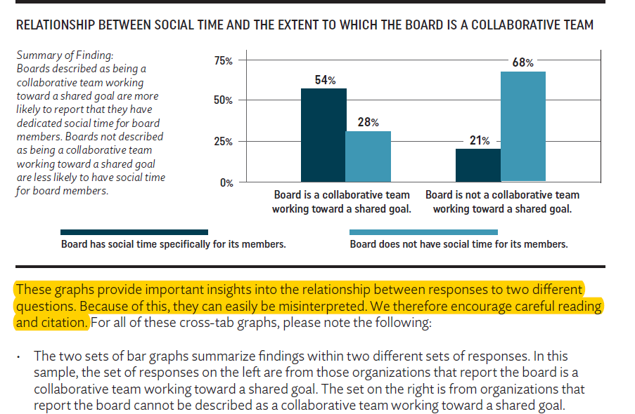
Slightly beyond that they continue with the reminder that correlation doesn’t equal causation:
It is important to note these relationships between responses are not intended to indicate causation; the data cannot support the idea that one characteristic causes the other. Given the potential for misinterpretation of these graphs, citations should include the chart or the summary of findings that is included, rather than interpreting and restating the graph
Even though good research focused on the concerns of non-profit cultural organizations is increasingly available in convenient, easy to comprehend formats, you as the reader are still responsible for investing additional effort into insuring you are interpreting and using the data in an appropriate manner.
Thank you for the authoritative read on this issue. To me, being able to actually see the icon in the…