Let’s talk about program books. I love looking through them at other organizations’ performances or exhibits, but they are a pain to pull together. There is an ungodly amount of information that must be gathered from every department, organized and formatted, that somehow needs to all fit into an eight page, black and white program section that needed to be to the printer yesterday.
One section in the books that many symphony and opera companies include is a “Program Notes” section. Usually, these program notes give background information on the composer, place the piece in historical context, and may often give a written synopsis of the piece or play; something like “The symphony begins with an E major chord by the low brass which is then picked up by the strings all while the flutes and clarinets play an ascending melody in major 3rds.”

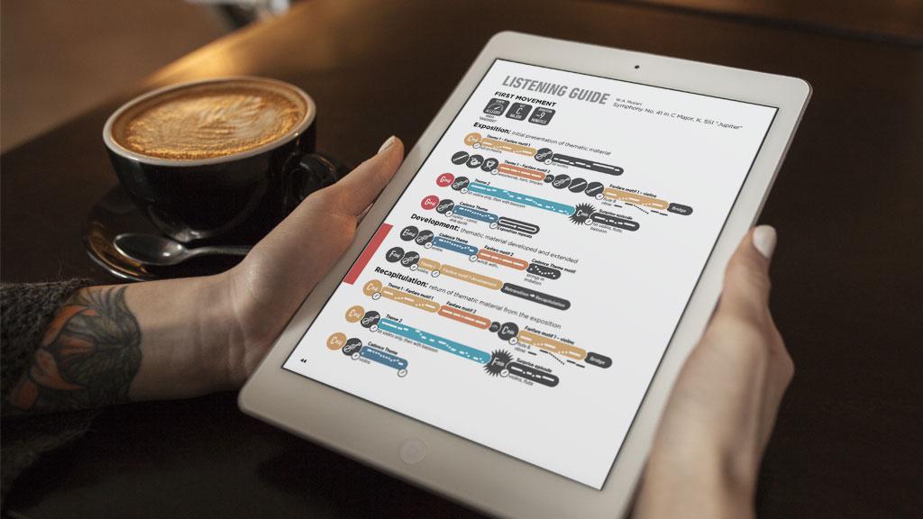
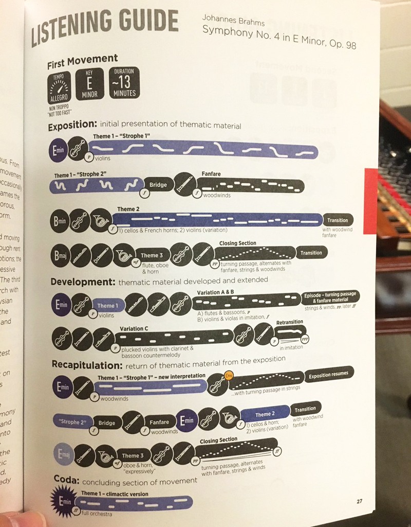
Many in the audience have a basic understanding of music, but they didn’t come for a music theory class. Figuring out how to make the music accessible to non-music theorists is often a challenge. The Toronto Symphony, though, has turned to a method used by elementary music teachers everywhere: the listening map. Mark Sinclair highlighted the TSO’s listening guides in a May 2016 article on Creative Review.
A listening map is a way of visually displaying a piece of music. Different sections of the piece are graphed out in a linear fashion that the listener can follow as the music plays. Some are very simple, but often, the maps are colorful and include pictures of instruments or cartoon illustrations highlighting the different sections.

The Toronto Symphony takes the same idea of the listening map, but cleans it up for grown-ups. Colors and pictures are still present, but now musical defintions like “coda” and “exposition” are included. The shaping of the phrases is also displayed.
I can’t help but think this visual guide is a welcome inclusion in the TSO’s program books for many audience members, both the seasoned musicians and symphony newbies. Orchestral can be long and the progression of the movement can be difficult to track if you’re trying to do it in your mind. Having a visual guide enhances the experience and allows for engaged listening. Which, as we try to grow our audiences is exactly what we want.