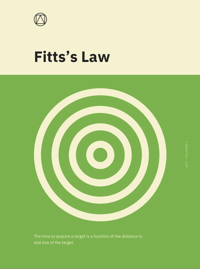
This series is designed to help those working in the arts and culture sector apply user experience (UX) best practices to daily content management tasks. Using Jon Yablonski’s collection at LawsOfUX.com that gathers best practices designers consider when building user interfaces, today’s installment will focus on Fitts’s Law: the time to acquire a target is a function of the distance to and size of the target.
Fitts’s Law
Per lawsofux.com/fittss-law, here’s how the Fitt’s Law is defined:
The time to acquire a target is a function of the distance to and size of the target.
- Touch targets should be large enough for users to accurately select them.
- Touch targets should have ample spacing between them.
- Touch targets should be placed in areas of an interface that allow them to be easily acquired.
Origins
In 1954, psychologist Paul Fitts, examining the human motor system, showed that the time required to move to a target depends on the distance to it, yet relates inversely to its size. By his law, fast movements and small targets result in greater error rates, due to the speed-accuracy trade-off. Although multiple variants of Fitts’ law exist, all encompass this idea. Fitts’ law is widely applied in user experience (UX) and user interface (UI) design. For example, this law influenced the convention of making interactive buttons large (especially on finger-operated mobile devices)—smaller buttons are more difficult (and time-consuming) to click. Likewise, the distance between a user’s task/attention area and the task-related button should be kept as short as possible.
When applied to web design, Fitt’s Law has a number of straightforward points of contact to consider.
Mobile Sweet Spots In Responsive Design
Odds are, your website utilizes responsive design, which is when page content and layouts are determined by the site visitor’s screen size. For example, a page with two columns of content on desktop will stack them into a single column on mobile.

There are two considerations here from a Fitt’s Law perspective:
- How do you handle critical call to action items, like buttons, located in the right-most column so it doesn’t end up at the bottom of the page on mobile?
- Where do you locate the most important call to action (CTA) within the mobile screen space?
The first issue has a few different solutions, one of which is content management oriented while the other is all about design.
There’s nothing wrong with doubling up your most important CTA, like “Buy Tickets” so it shows up in more than one column. This is a great option that requires little to no design or code skills.
Alternatively, you can swap the order of mobile stacking with a little code, so the right column ends up on top. But even that option requires some content management forethought in that you don’t want the content in the right column to be so long, it pushes the main content too far down the screen.
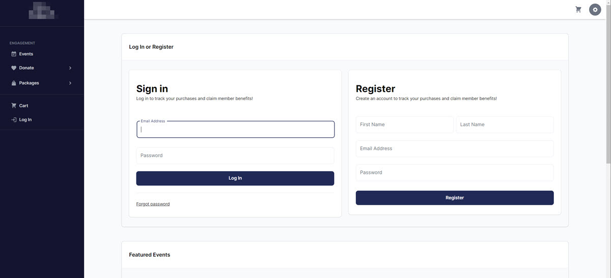
The second issue requires a little empathy by taking into consideration both left-hand and right-hand users. For example, let’s consider the ubiquitous login page. On desktop, making sure the buttons are located toward the center of the screen to minimize distance to reach is a straightforward task.

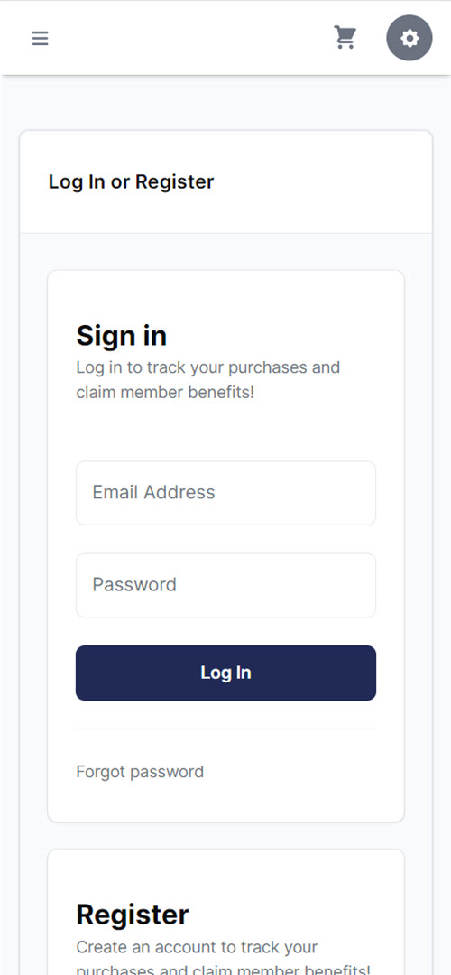
But on mobile, you want to locate the CTA “Log In” button in a sweet spot for both right- and left-hand users. The easier that button is to reach, the quicker and easier it is for users to log in.
Here’s a visualization showing where that Fitt’s Law comfort zone falls.
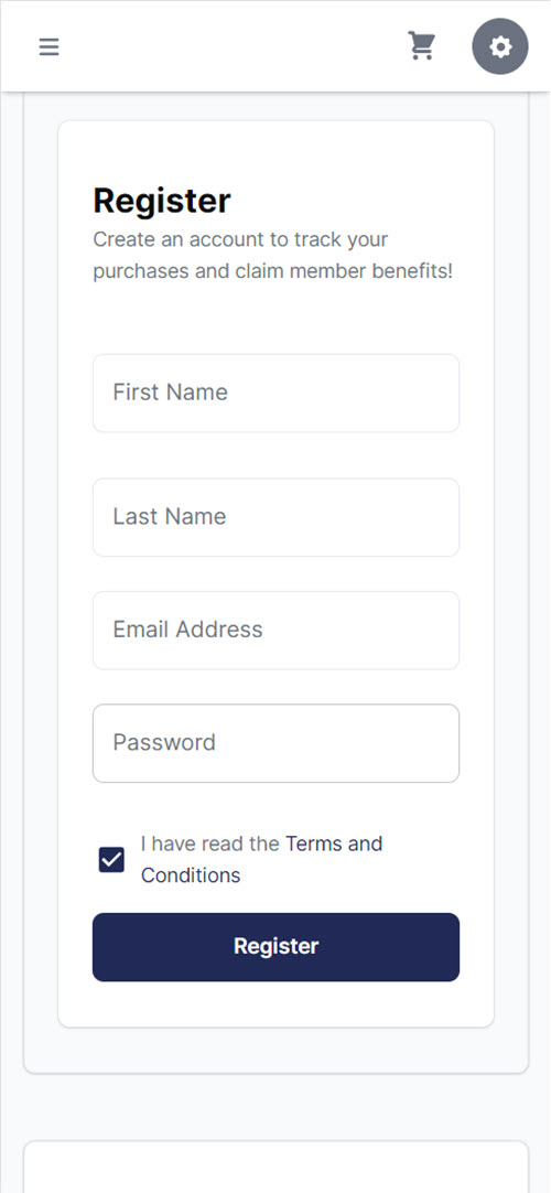
Using the real-world design example above, from one of my Ticketing CRM client sites, you can see where that Log In button falls right in the sweet spot for either dominant hand user. Same goes for the Register button if the site visitor needs to create a user account.


In those instances, a button that occupies the full width of its container located in the green comfort zone for both types of users produces the best result.
Show Yablonski some love and order one or more of the posters he designed for each practice covered at lawsofux.com, which is completely free to use. You can purchase them at his online store.

Thank you for the authoritative read on this issue. To me, being able to actually see the icon in the…