Along with death and taxes, you can be certain that Goggle will update the integrated tools inside its Chrome browser. One of the latest updates includes enhancements to their device emulator, a feature we covered in detail via an article from 7/15/2015. You can visit that post to better understand why this tool is important and how it will help you master the art of responsive web design, but today’s post is going to cover the nuts-and-bolts for the functionality updates.
Toggle On Device Mode
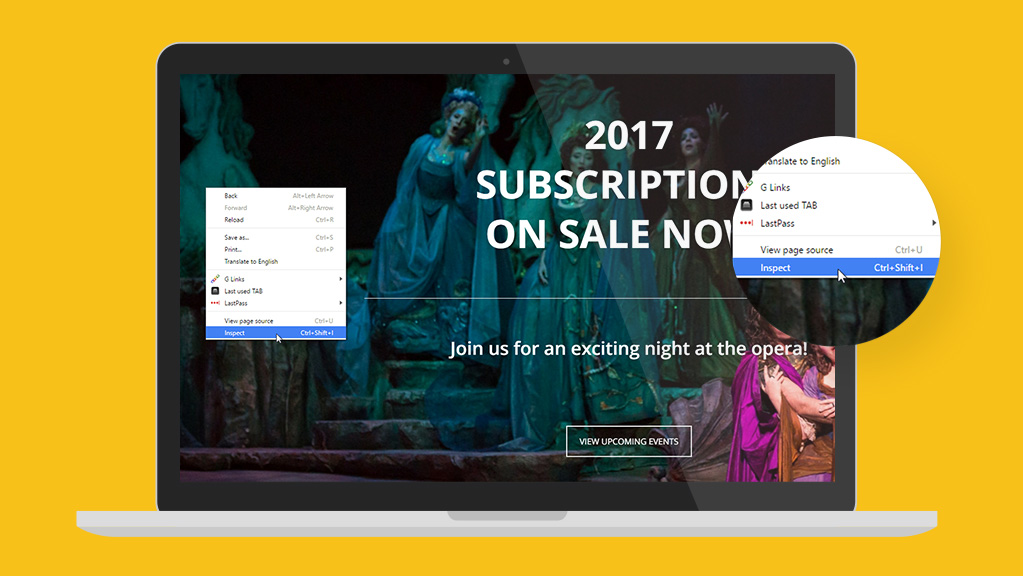
The device emulator, now called “Device Mode,” is now enabled by default. To access, right click anywhere on the screen then follow these steps:
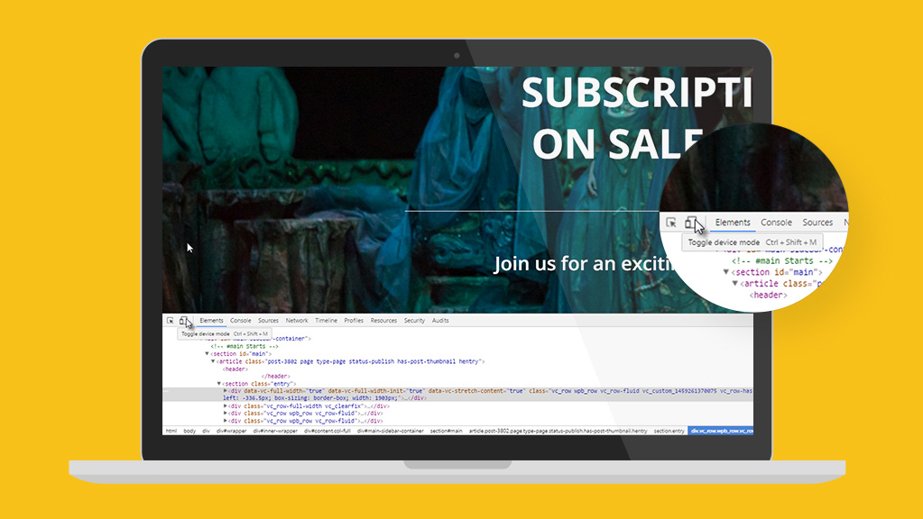
Tip: toggle device mode on/off using keyboard shortcuts: Ctrl+Shift+M (or Cmd+Shift+M on Mac).
Here’s where you’ll begin to see many of the latest enhancements, and although a lot of them are geared toward developers, the ones that you’ll work with the most include:
- A clean and simple design with a lighter color palette for the DevTools navigation bar.
- A new quick-jump device ruler over the media queries.
- A centered viewport and a new quick-jump device ruler at top of the screen.
Editing Built-in Device Presets
Instead of listing all available devices in one long dropdown list, Google now provides a shorter list that you can edit as desired.
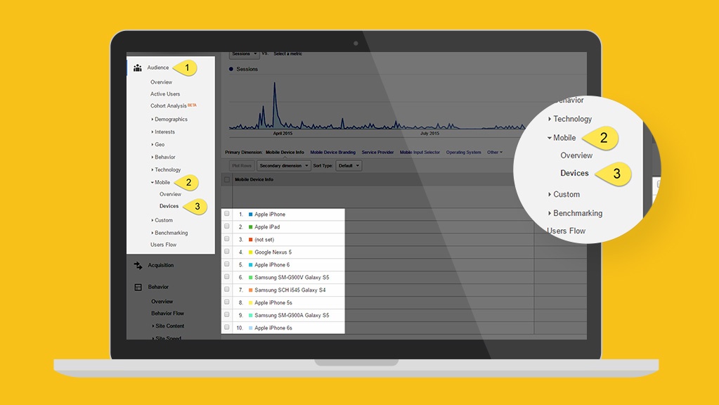
If you’re wondering which ones to include, here’s where your Google Analytics (GA) skills you’ve been developing with ArtsHacker’s GA tuts are going to come in handy!
You can narrow down which devices to include by seeing which ones appear in your “Audience > Mobile > Devices” GA admin panel:
Once you have that list handy, you can add the ones you want by editing the default list.
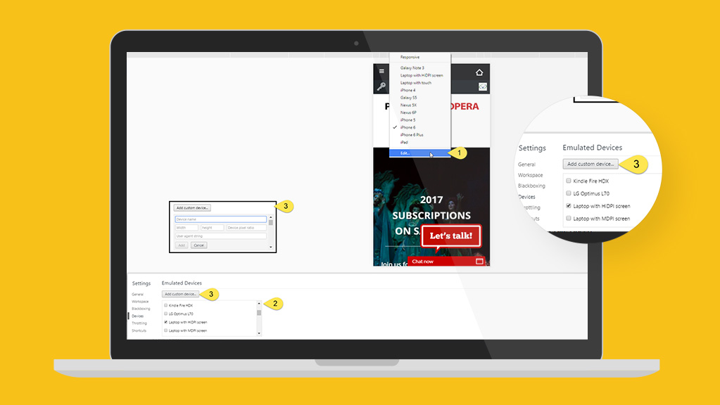
2. Select which devices you want to display from the available list.
3. For advanced users, you can create custom device displays via the “Add custom device…” option. When activated, an options box will appear at the top of the existing options list.
TIP: this can be especially handy for those of you with an executive or key board member who uses an unusual monitor resolution (look like a genius!).
Practical Application
One of the most common tasks you’ll perform when using Device Mode is scaling text across devices.
Show of hands, who uses big, beautiful font sizes on hero images?
Of course you do. It’s all kinds of awesome.
But those mega font sizes rarely work on smaller mobile devices, but this is where Device Mode is going to turn that lemon into lemonade.

This is where Device Mode shines because it allows you to identify issues like this in a matter of seconds.
Get started by opening up six browser tabs, each one set to display the page you want to test. Enable the “Inspect” tool but only activate Device Mode in the last five tabs. Select a different device for each tab; I typically use desktop, laptop with touch, iPad landscape, iPad portrait, iPhone 5 landscape, and iPhone 5 portrait but you can use any combo you wish based on your GA research.
Here are some examples of the PBOpera.org homepage hero after adjusting the font size accordingly across each device’s browser thresholds (called media queries). You can see that their homepage hero image and text will look great on each device; moreover, they can apply the same font sizes across similar hero images on other web pages.
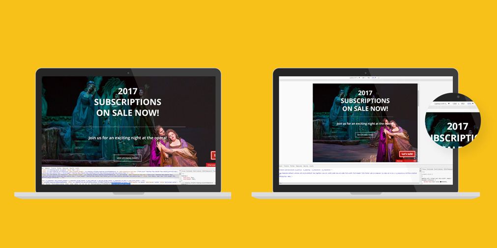
Right: “Laptop with touch” view
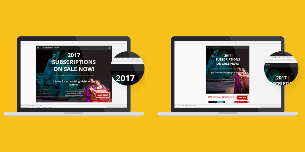
Right: iPad, portrait mode.
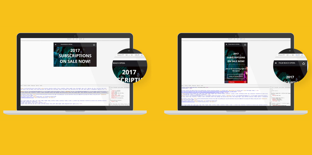
Right: iPhone 5, portrait mode.
Thank you for the authoritative read on this issue. To me, being able to actually see the icon in the…