Undoubtedly, arts organizations want to maintain as large of a list of engaged subscribers as possible when it comes to their users. But there’s a fine line between encouraging ongoing engagement and outright tricking patrons into signing up or making purchases they didn’t mean to.
That’s exactly what Dark Patterns are; tricks used to make users engage in an action they didn’t intend.
User Experience professional Harry Brignull is a champion of calling out Dark Pattern practices and educating marketing professionals on how to avoid it.
The more you learn about Dark Pattern practices, the more you begin to see how your organization may be employing them, even on an unconscious bias basis.
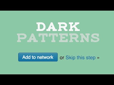
Here’s a great video from Bringnull that walks you through understanding what Dark Patterns are and the ways they are employed:
Bringnull also provides a terrific list of the types of Dark Patterns to avoid:
- Bait and Switch › You set out to do one thing, but a different, undesirable thing happens instead.
- Confirmshaming › Confirmshaming is the act of guilting the user into opting into something. The option to decline is worded in such a way as to shame the user into compliance.
- Disguised Ads › Adverts that are disguised as other kinds of content or navigation, in order to get you to click on them.
- Forced Continuity › When your free trial with a service comes to an end and your credit card silently starts getting charged without any warning. In some cases this is made even worse by making it difficult to cancel the membership.
- Friend Spam › The product asks for your email or social media permissions under the pretense it will be used for a desirable outcome (e.g. finding friends), but then spams all your contacts in a message that claims to be from you.
- Hidden Costs › You get to the last step of the checkout process, only to discover some unexpected charges have appeared, e.g. delivery charges, tax, etc.
- Misdirection › The design purposefully focuses your attention on one thing in order to distract you attention from another.
- Price Comparison Prevention › The retailer makes it hard for you to compare the price of an item with another item, so you cannot make an informed decision.
- Privacy Zuckering › You are tricked into publicly sharing more information about yourself than you really intended to. Named after Facebook CEO Mark Zuckerberg.
- Roach Motel › The design makes it very easy for you to get into a certain situation, but then makes it hard for you to get out of it (e.g. a subscription).
- Sneak into Basket › You attempt to purchase something, but somewhere in the purchasing journey the site sneaks an additional item into your basket, often through the use of an opt-out radio button or checkbox on a prior page. This is one arts orgs should be high alert for, especially with the way donations are added to the cart during the checkout process.
- Trick Questions › You respond to a question, which, when glanced upon quickly appears to ask one thing, but if read carefully, asks another thing entirely.
Removing Dark Patterns From Your User Experiences
Once you’ve identified Dark Patterns, the next step is replacing them with something better.
In some cases, this may be entirely within your direct control. A good example is your email campaign templates.
Most reputable email marketing providers make it easy for you to customize the unsubscribe process so the language inside email messages is easily located and employed by the end user. One low hanging fruit Dark Pattern to check for there is a lack of adequate color contrast in link colors for the unsubscribe footer links in email and transactional messages.
For example, here’s ArtsHacker’s weekly email summary footer design:
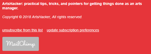
- While text and links are the same color, links are underlined.
- Unsubscribe and update subscription links are the same font size as standard text.
- The URL for each link target takes you to the respective unsubscribe or update preference page at MailChimp.
- From there, the instructions and user interface feature a clear with easy to understand human friendly copy.
If we wanted to be Dark Pattern jerks about it, here’s what we would do:
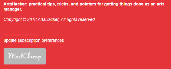
- The unsubscribe link would be a smaller font size, similar in color to the background color, no underline.
- Emphasis would be placed on the subscription preference link as that has less likelihood for the user successfully unsubscribing.
In other situations, you may have little to no control, such as a third-party box office or ticketing provider.
In those instances, the third-party provider designs and controls the entire user experience from account creation to deletion. The best way to identify potential red flags is to put on your quality assurance (QA) big boy pants and through all the relevant processes.
Yes, QA is a real grind but power through it and you’ll be happy with the outcome.
Contribute To Something Constructive
Bringnull does everything he can to make it easy for you to identify Dark Patterns in your own user experiences and call out examples you come across in your daily web journeys:
Use Twitter to spread the word about Dark Patterns. It’s the most effective way to put pressure onto companies to stop using Dark Patterns.
- Retweet, quote and favorite other people’s tweets about Dark Patterns.
- @mention the offending brands and tell them what you think about their practices.
- When you see a Dark Pattern, take screenshots and tweet it. Mention @darkpatternsor use the hashtag #darkpattern.
- If you’ve got an example that doesn’t fit into a tweet, you can use a platform like medium or imgur, then tweet it.
Thank you for the authoritative read on this issue. To me, being able to actually see the icon in the…