Infographic: ˌinfōˈɡrafik/ (Noun) a visual image such as a chart or diagram used to represent information or data.
So, yes, pie charts and venn diagrams are certainly in the infographic field. But, there are snazzier ways of jazzing up an infographic. If you’re not quite as handy at Adobe, but want some gorgeous graphics to send to the board, audience, or funder, try out Piktochart. A few minutes on here and some beautiful things have been created. Picktochart has a pro-version which offers access to more backgrounds, images, better downloads, etc. but their free version offers a lot too.
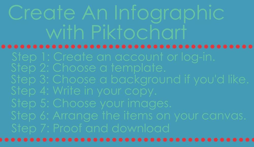
Step 1: Create an account
You do have to create an account to use Piktochart, but you can link it to Facebook for easy access. Once your account is created, this enables you to save your piktocharts and go back and revisit them, basking in your own brilliance.
Step 2: Choose a template
If you go for the pro version, there are 100s of templates that you can plug-and-chug your content into. The free version is a bit more limited to templates that are ‘featured’ for a short time and the create your own (CYO) template. I’ve found that the “create-your-own” template can do wonderful things, so it’s almost always my go-to.
Step 3: Set a background
Choosing any of the templates (in this case the CYO) takes you to an editable version. Choosing a background if you want one is a great first step and there are several to choose from. Changing just the color will give you a solid background in your chosen color.
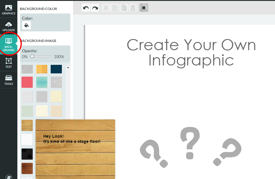
If you do choose a background and want it throughout, you need to add it to each individual “block” or field on the canvas. Change the width or other settings or completely delete a block by hovering clicking on it and using the tool bar that appears to the left.
Step 4: Write some text
After deciding on your background, get the text part out of the way. Choosing the text box on the left brings up several different fonts and headers to choose from. After clicking on one, a text box appears on your piktochart. Simply highlight the text and type in your own.
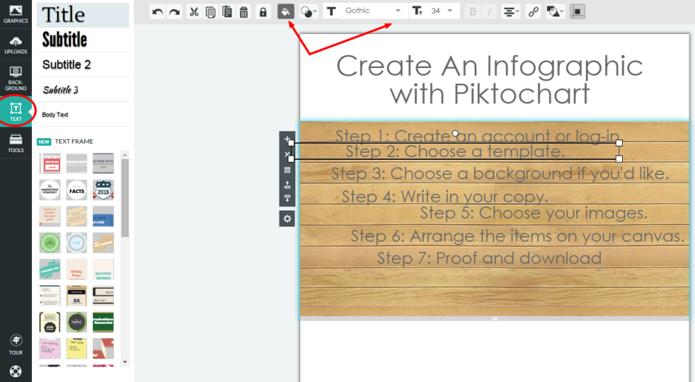
Break the copy into a few different text boxes – this will give you room to play when arranging on the infographic. Don’t worry quite so much about placement in the correct block. Text boxes are easily movable and once you know how much copy you’re working with, you can drag to the right blocks.
Step 5: Add graphics
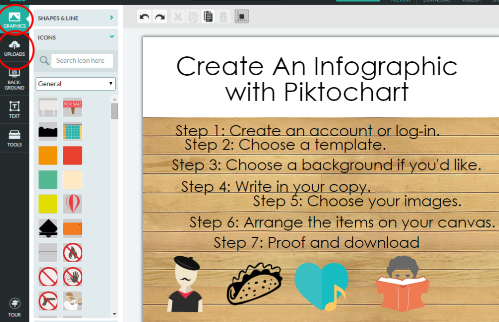
There are several hundred images and pictures in Piktochart’s image database that you can use to spice up your infographic. Depending on what image you are using, some are adjustable in size and color, so you can change it to match your color palette.
BUT, be careful of using too many or the images could detract from your content. You can also upload your own images (keeping an organizational logo graphic in your uploaded image library is a must!)
Again, pictures are easily movable, so just get them on the canvas and see what you’re working with.
Step 6: Arrange it
Now, drag and drop the text boxes and images into an order that works for you. If you’re having trouble aligning the objects evenly, turn on the alignment lines which guide you to different spots. They can be distracting and limiting sometimes, so if this happens, turn them off for a while until you need them again.
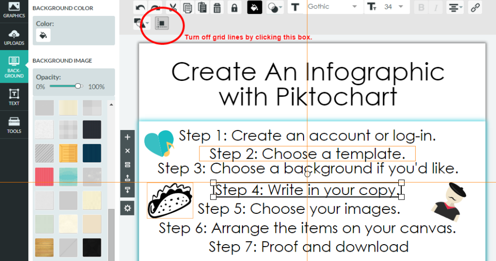
Step 7: PROOF and download
It’s the worst feeling in the world when you download and print something only to find that you spelled “symphony” as “sympony”. Yes, you can go back and edit in piktochart, but it will save you some sweet time if you make sure your “audience” is not “audence”.
Downloading is where the pro version has some advantages – higher quality, removing the watermark, different versions available. But, there are some crafty ways around all of those.
Click “download as image” and a pop-up appears asking what type of file to download as and the quality. Free users can select Low or Medium, which should be suitable for smaller printing jobs (anything much bigger than legal size starts to get weird). It should start downloading to your computer immediately. You do want to open it and check it. Piktochart changed some of their settings for free users and since the change, I’ve found my infographic isn’t always quiiiiite as I had created it (different alignments, different fonts, etc.) Maybe just a bug in their system, but maybe something else. Check it and re-edit if you find any errors. Lastly, make sure to crop it to the size that you’ll be using.
Woop! You know have a killer graphic to print in programs, post on websites, share on social media, or include in grant requests. Make an awesome one? I’d love to see it!
1 thought on “Creating Awesome Infographics”