[box style=”note”]There is a more recent version of this article available that includes updated instructions on how to activate and use this Google Chrome tool.[/box]
One of the single most daunting problems arts orgs face when converting to responsive design is embracing the mobile first concept; meaning, you no longer envision website design from a desktop-only or desktop-first perspective. Instead, you need to begin with the mobile browser environment and work your out from there.
Sure, that sounds great but who has a few dozen mobile devices laying around to see how your site looks and functions within all of those unique environments?
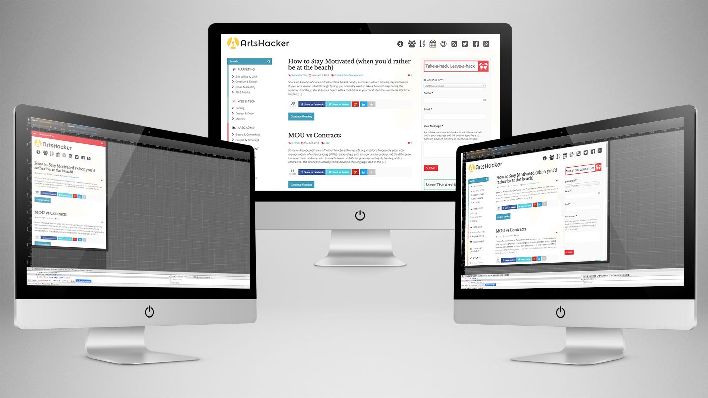
Fortunately, Google’s Chrome browser comes to your rescue thanks to a remarkably versatile device emulation function within its Inspect Element DevTool.
>>> DON’T STOP READING! <<<
Just because we’re using terms like “DevTools” isn’t a reason to tune out and rest assured, we’re going to light on tech jargon from here on out.
More to the point, you don’t have to have any tech or coding skills whatsoever in order to take advantage of this tool; in fact, you can be a complete Luddite and still benefit from what device emulation has to offer.
In order to make the process even easier, I’ve composed a short, four minute screencast video that walks you through the entire process as well as providing a few pro-user tips.
But if you’re more of a written word kind of learner, Google provides excellent documentation on everything covered in the tutorial video (as well as their own video, although for my tastes, it takes too long to simply get to it) via their DevTools Docs resource. If nothing else, it’s good to keep this URL handy as google routinely updates the content whenever features are tweaked.

Why Does Any Of This Matter?
I can’t count the number of times I’ve seen an arts org website redesign crash and burn thanks to HiPPO (Highest Paid Person’s Opinion) decision making. In those instances, an executive manager will typically want to have input on the design process (as they should) but in nearly every case, that individual will only look at the site on a desktop/laptop browser and every once in a while, a tablet.
As a result, you end up adopting a woefully outdated desktop-first design process that generates a steady stream of feedback, change requests, and questions based on that limited perspective. That’s a nice way of saying that the HiPPO in question will completely, albeit it inadvertently, screw up the redesign and leave your organization with a new website that is not only outdated but provides a hobbled mobile user experience as well.
Look Like A Genius!
I can say from firsthand involvement that introducing clients to Chrome’s Device Emulation mode for the first time can be a “caveman discovering fire” experience. Consequently, anyone tasked with spearheading a website redesign will be wise to introduce the site to senior staff members using this tool; frankly, you’ll look like a genius and help mitigate desktop-first decision making without ever having to address the situation.
Most individuals find the tool so much fun to use, they’ll go out of their way to take advantage of it throughout the design process. Welcome to the win-win circle!
Not Using Responsive Design?
Good luck with that. At this stage in the game, any organization undergoing a website redesign and isn’t using a responsive platform is better off taking the cash allocated to the project, piling it up on your meeting room table, and lighting it on fire.
Seriously though, this is a crucial aspect of improving marketing performance and overall outreach so we’ll cover the “why” end of this topic in more detail down the road.
Additional Resources
If you aren’t a Google Chrome user (and for development purposes, you should be) that doesn’t mean you’re out of luck.
- Mozilla’s Firefox browser provides a similar function called Responsive Design View; they provide written instructions along with a screencast video at their documentation site.
- Apple’s Safari browser isn’t as user friendly in this sense and I don’t recommend using it. But if you insist, you’ll have to go digging through their Web Development Tools documentation to learn more.
- Microsoft’s Internet Explorer 11 provides emulator modes as well but much like Safari, they aren’t terribly user friendly. You can read more via their official documentation. Using a version of IE earlier than 11? Sorry, but you’re on your own and really, just upgrade. The sooner we get rid of those older versions, they better.
Questions? Fire away via a comment.

Didn’t know about this. Cool! Thanks for pointing it out…
You’re very welcome and I hope it continues to be useful down the road.